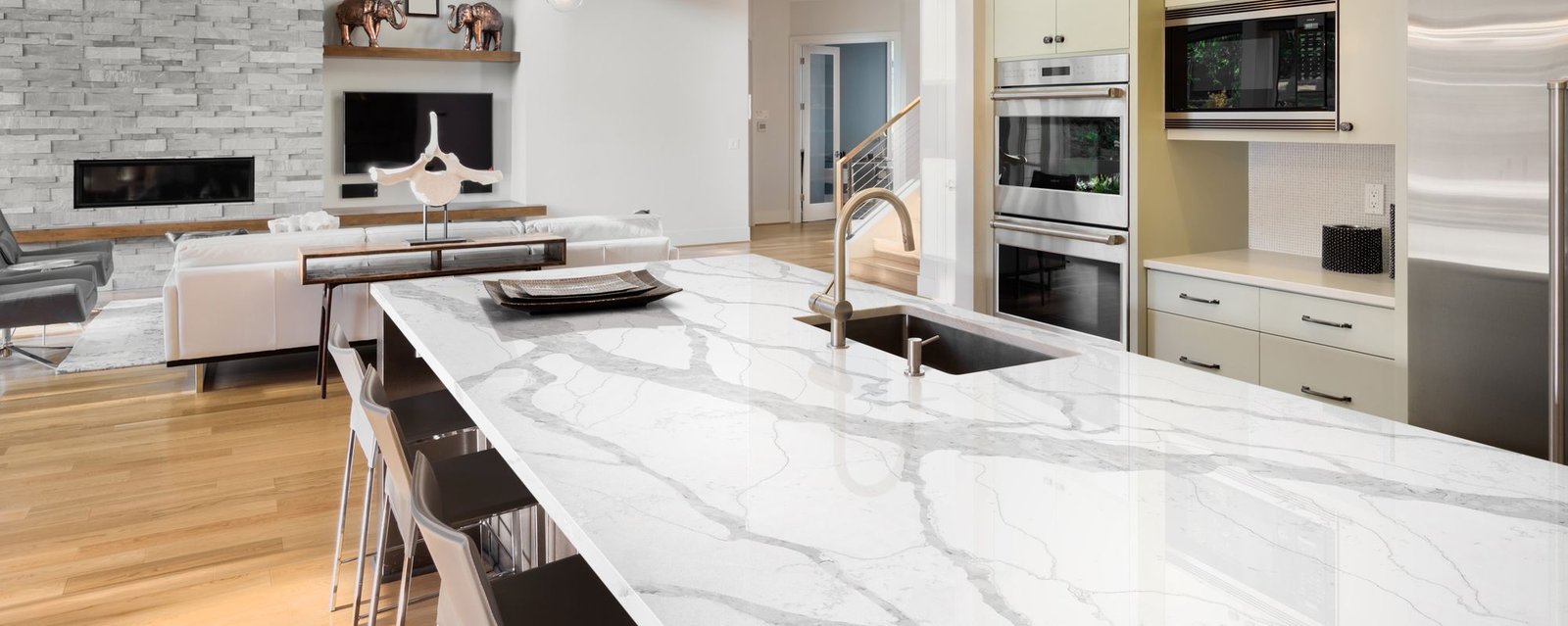
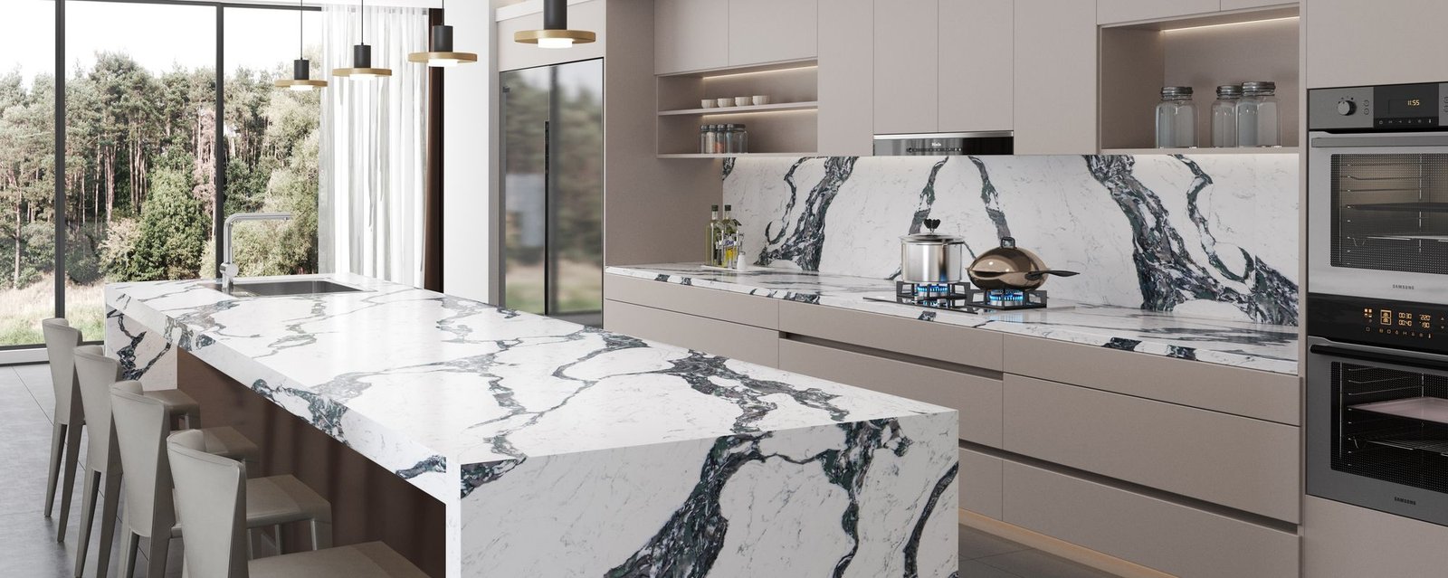
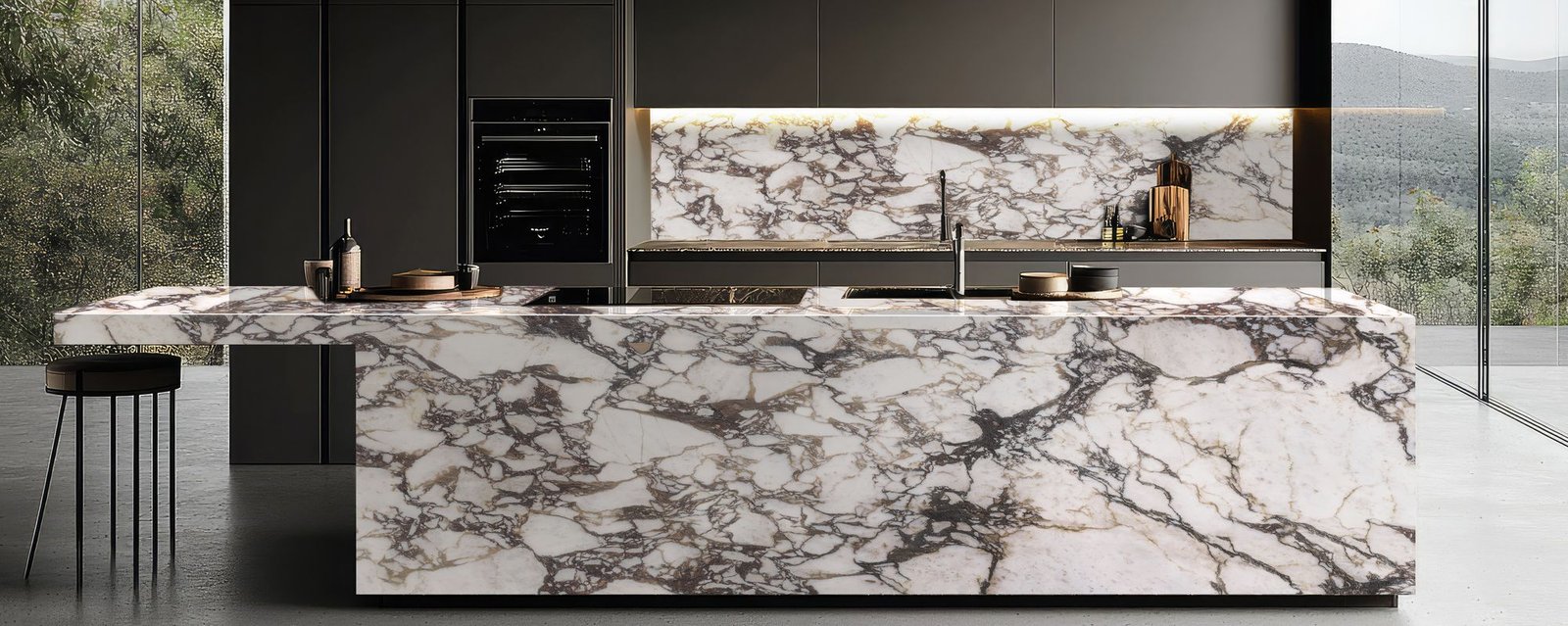
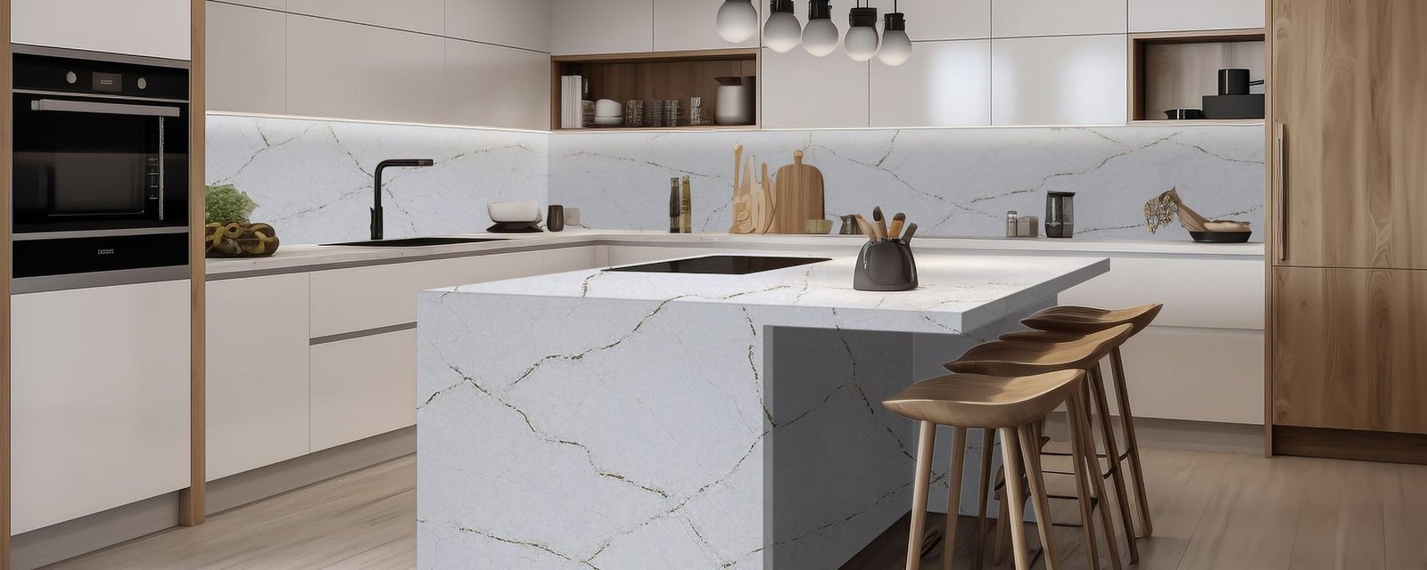
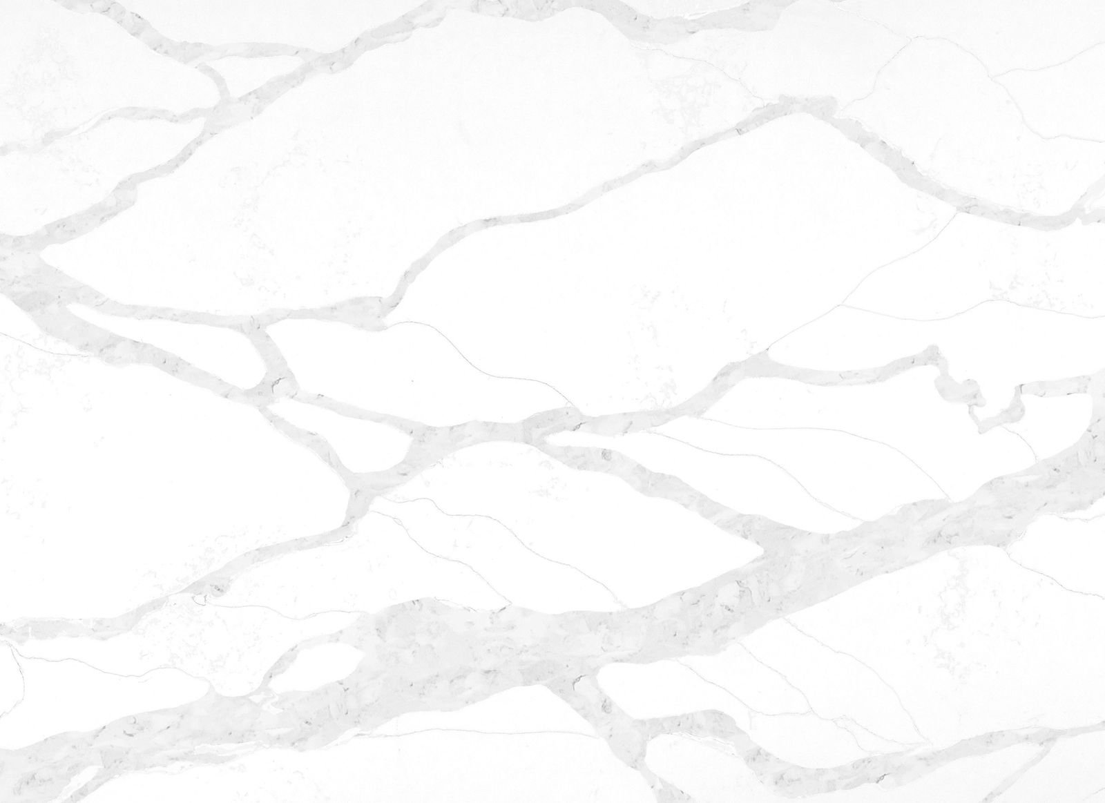
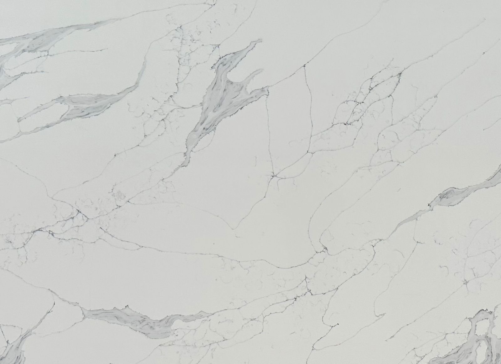
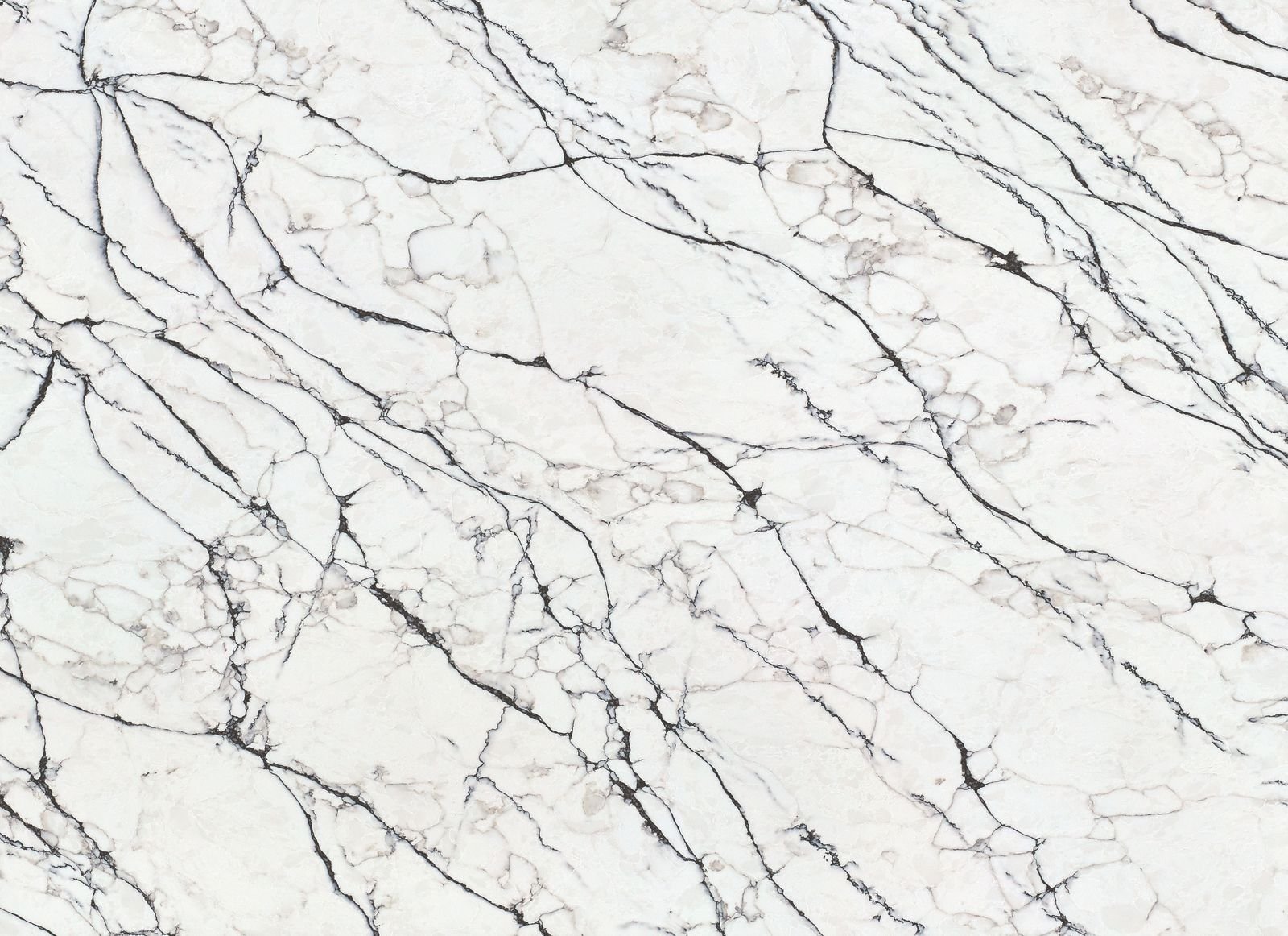
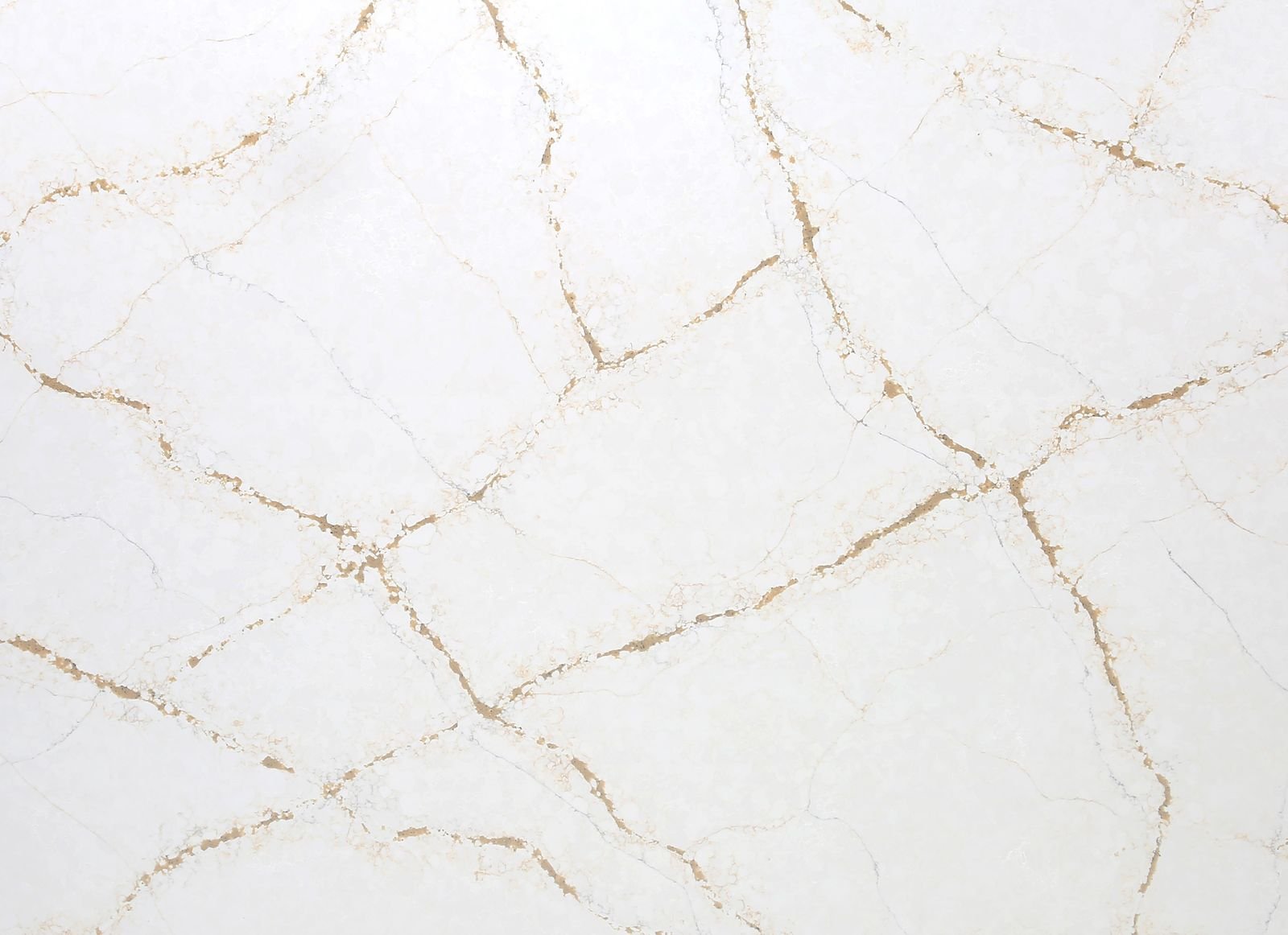
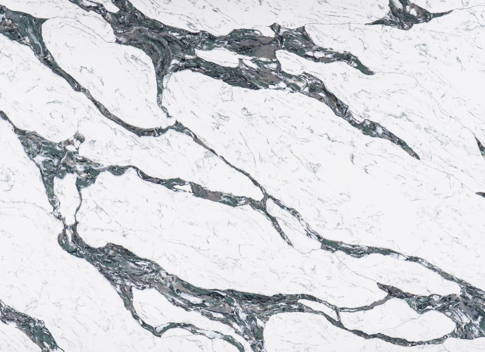
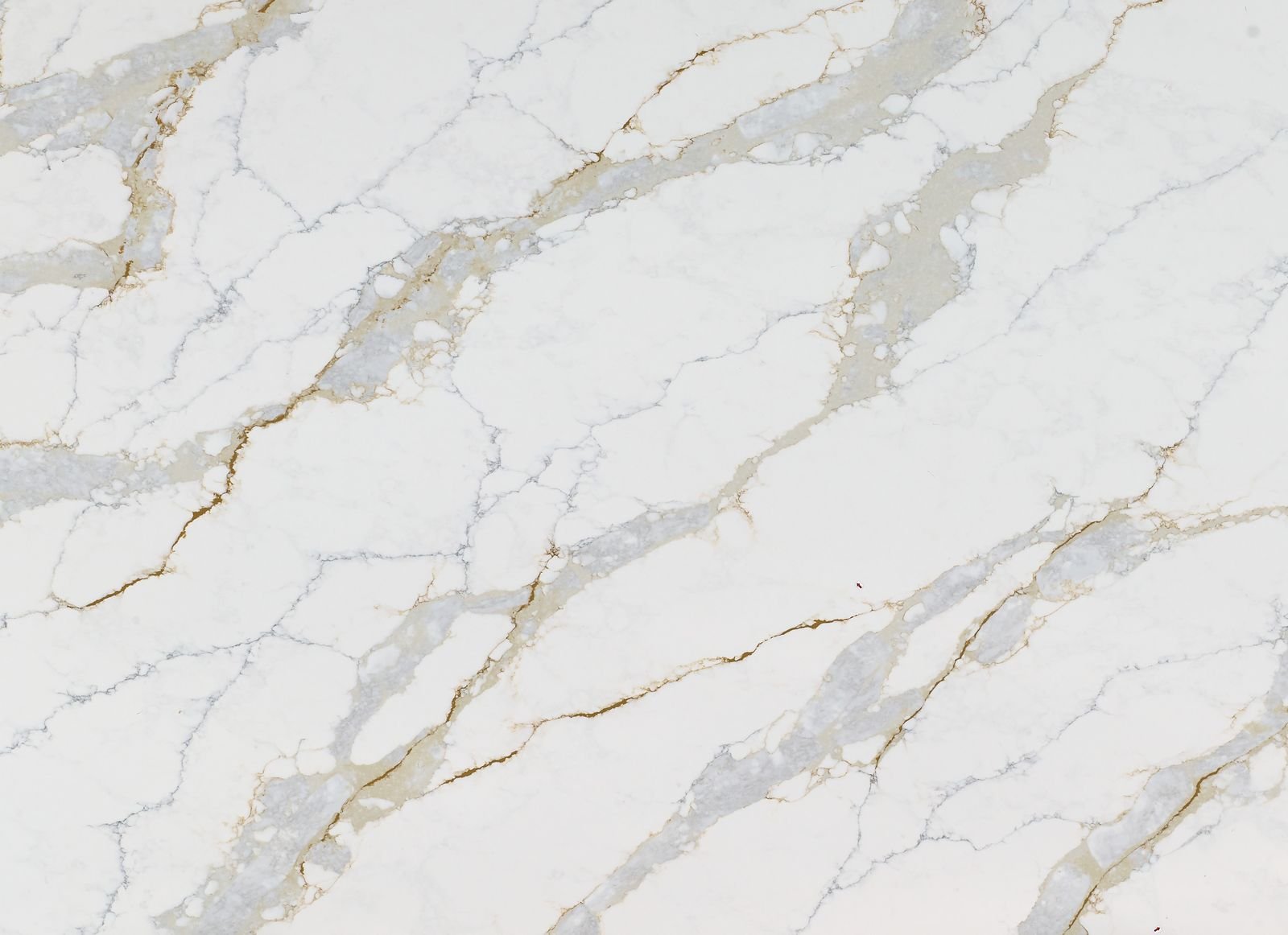
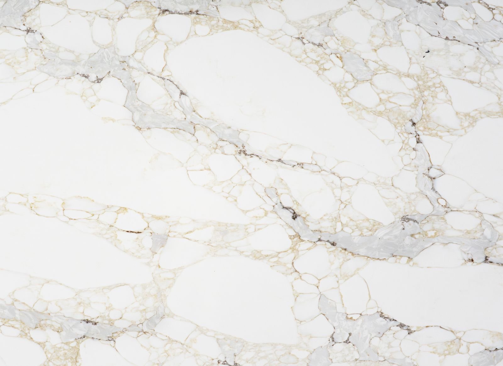
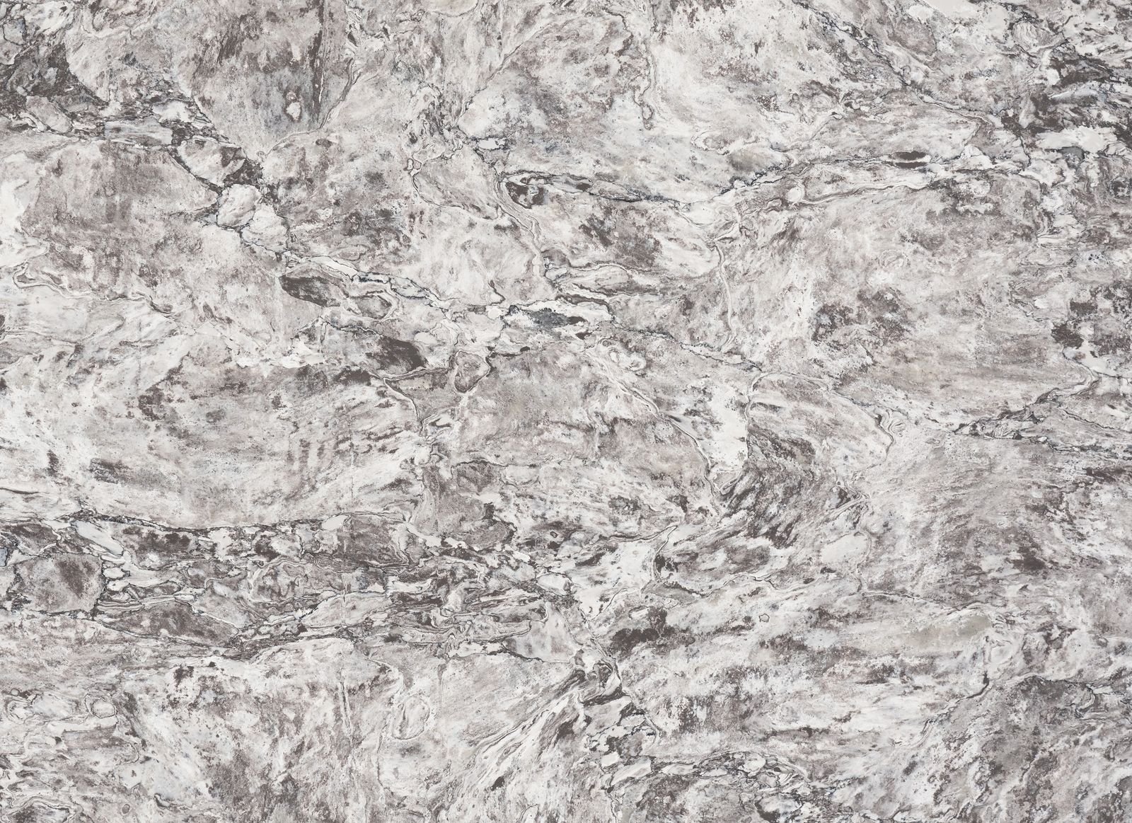
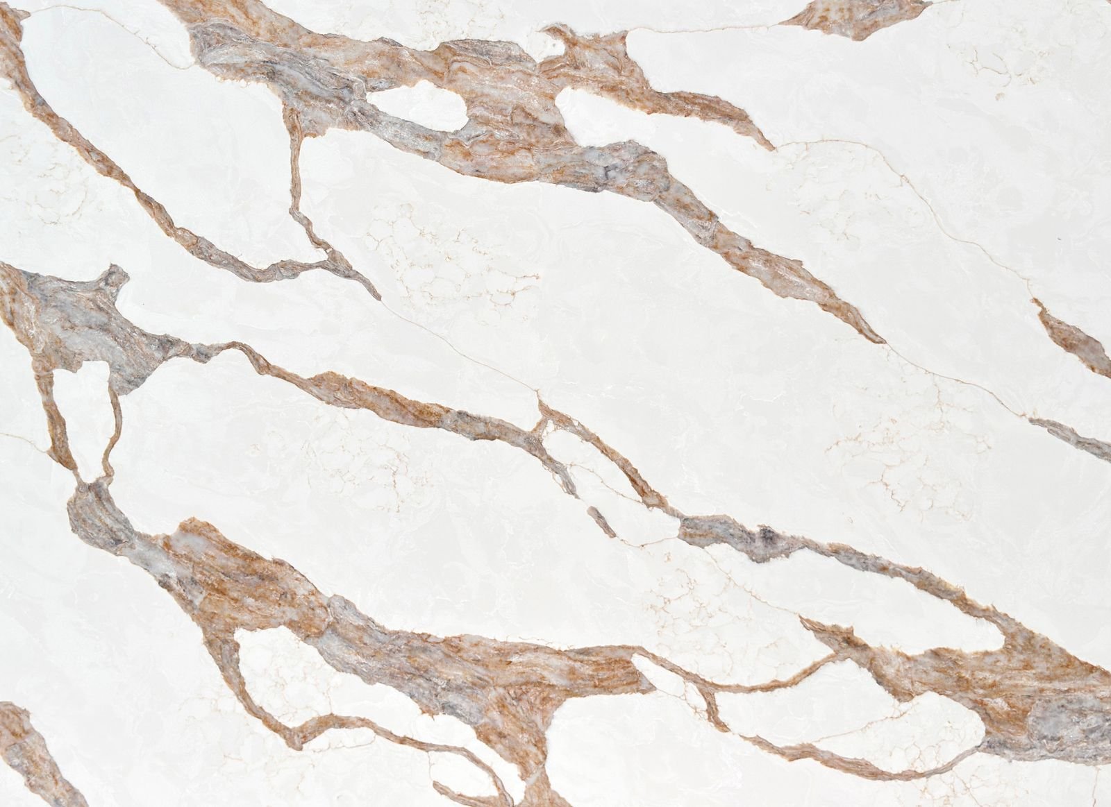
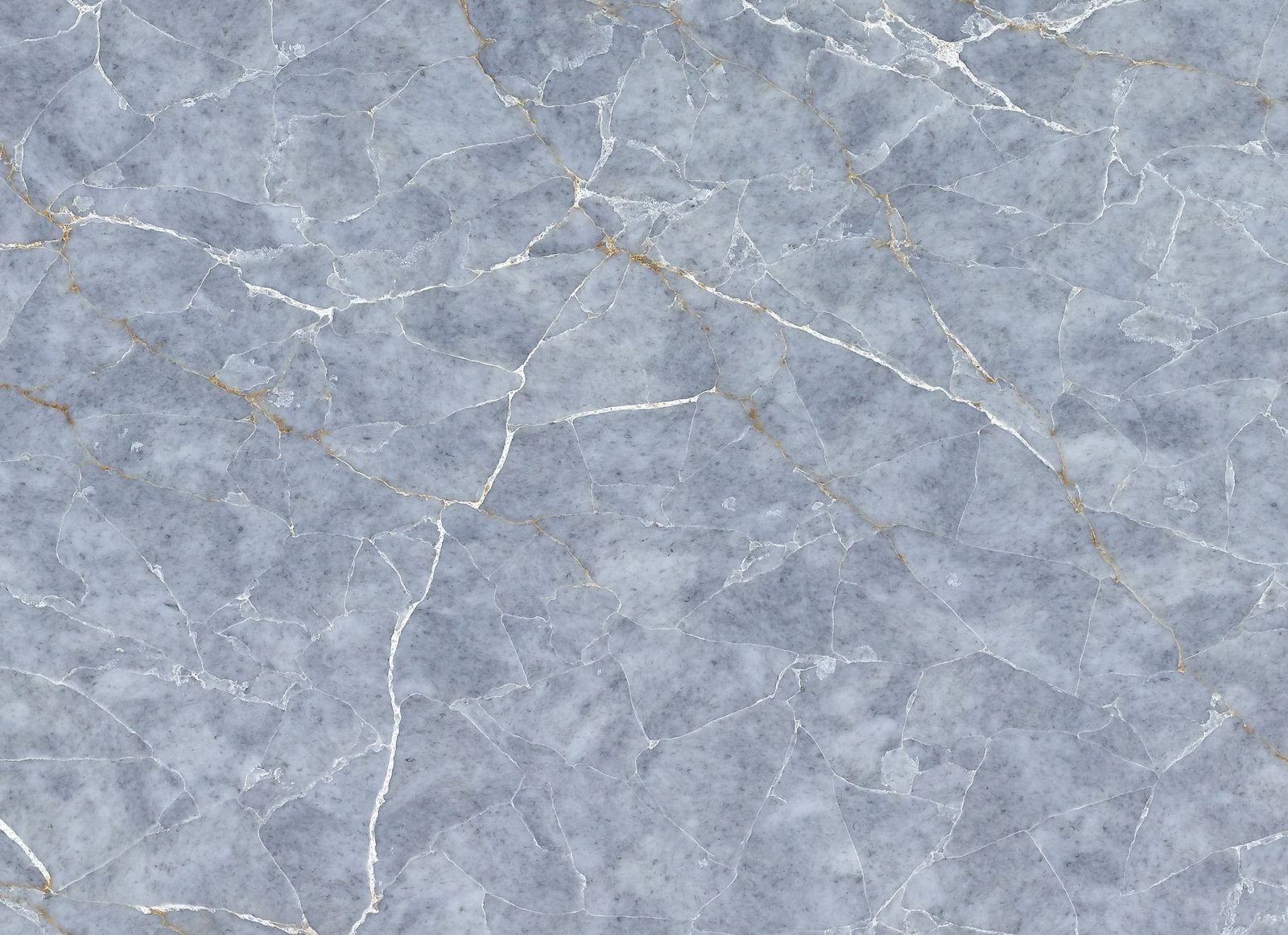
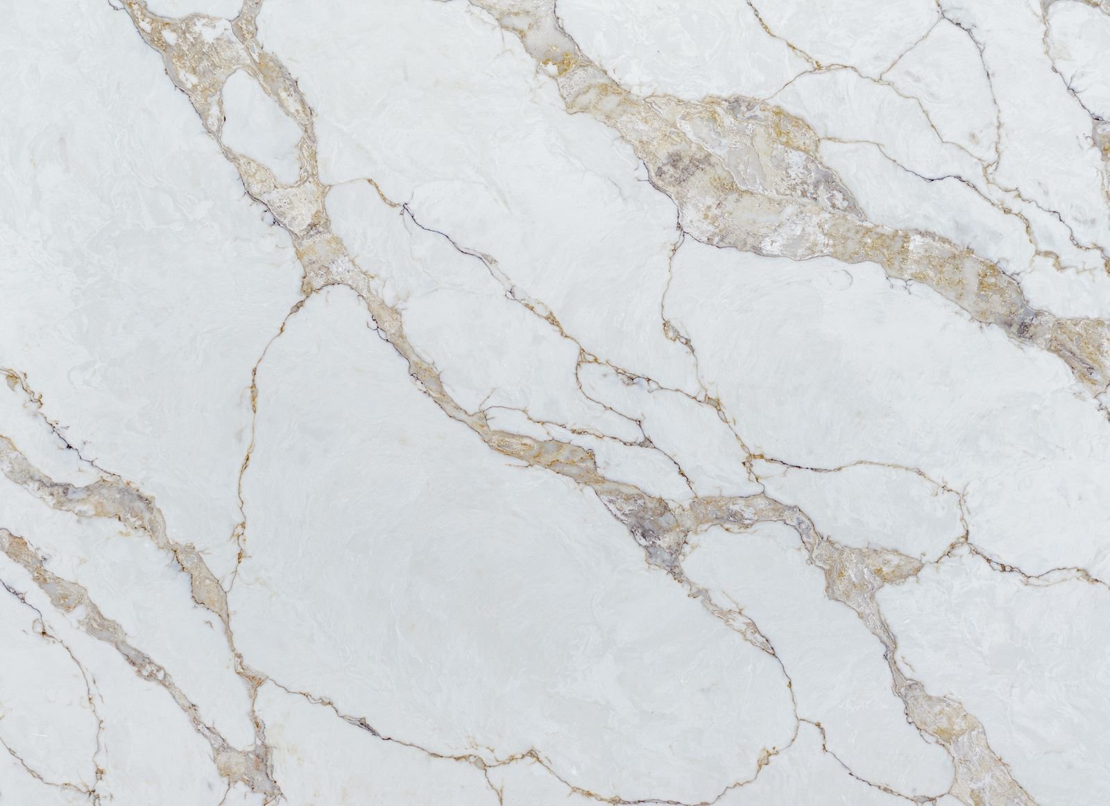
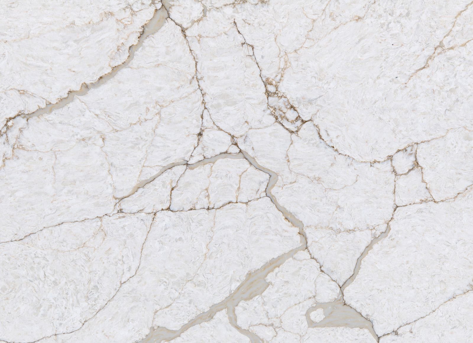
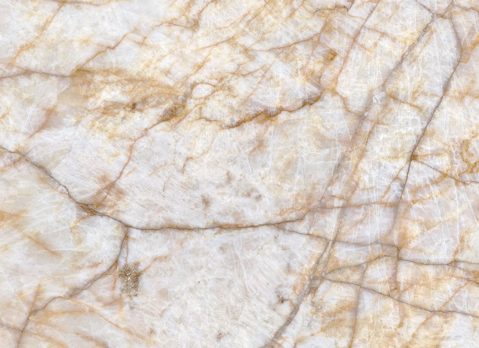
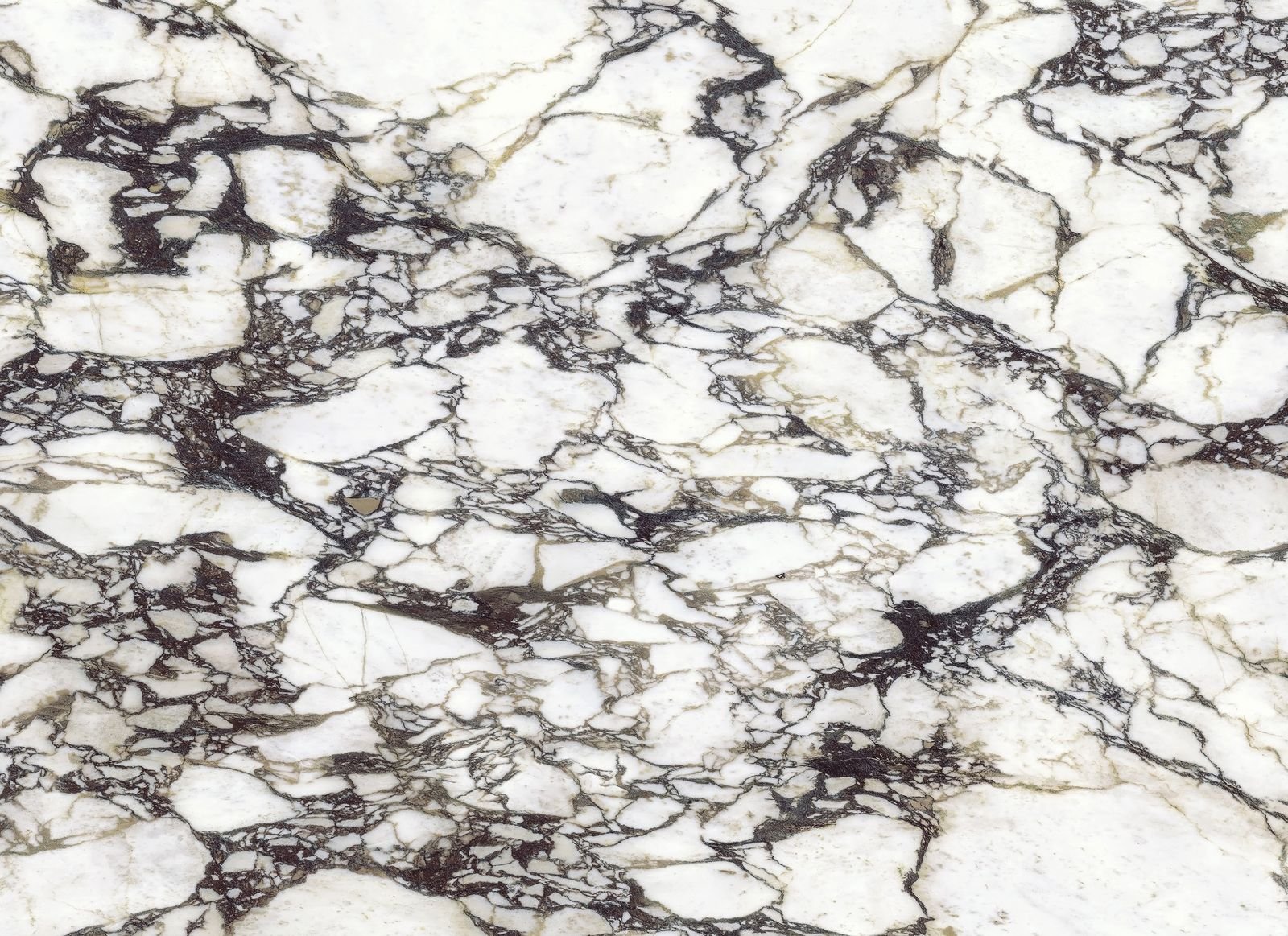
Bold veining, rich colour and real movement. A statement surface turns an island, a full-height splashback or a waterfall end into the centrepiece of your kitchen, without changing the units.
A bold slab needs room to be seen. These are the places it has the most impact.
Islands and waterfall ends
A large uninterrupted island top shows the pattern at its best. Add waterfall ends and the quartz runs down to the floor, turning the island into a piece of furniture.
Full-height splashbacks
Taking the worktop up the wall, behind the hob or the whole run, gives one continuous surface with no grout lines. It is the most dramatic way to use a statement slab.
Bookmatched slabs
Some colours are made as mirror-image pairs, so the pattern opens out across a joint like the pages of a book. Ideal for splashbacks and wide islands.
Getting it right
Planning a statement surface
A bold slab rewards a little planning. We go through all of this at the survey, so there are no surprises when it is fitted.
Vein layout. We plan where the veins fall across joints and corners, and show you before anything is cut.
Slab size. Slabs are 3200 x 1600mm. Islands or runs longer than that need a joint, which we position where it looks best.
Matching pieces. Splashbacks, upstands and waterfall ends are cut from the same slabs, so colour and pattern match.
Keep the rest calm. Plain doors, simple handles and quiet walls let the worktop do the talking.
Thickness. 30mm gives an island a more substantial look; 20mm suits splashbacks and slimmer, modern lines.
Lighting. Good under-cabinet and pendant lighting brings out the depth, especially in translucent colours.
The colours
Statement colours
Our boldest patterns, from crisp white with dramatic grey veins to gold, green, violet and black. Some are on offer right now.