Colour pairing
Contrast or tone? Choosing a worktop to set off your cabinets
Some kitchens look best when the worktop stands apart from the cabinets. Others feel calmer when the two blend. Here is how each approach works, the pairings we would start with, and how to tie the two together.
Start here
Three things create contrast
Contrast is not only light against dark. Three things decide whether a worktop stands out from your cabinets or blends in, and you can turn each one up or down.
- Light and dark. The strongest effect. A pale worktop on dark units, or the reverse, reads as crisp and deliberate.
- Warm and cool. A cool white on warm cream units looks brighter and fresher; a warm white on the same units looks soft and joined up.
- Plain and patterned. Bold veining stands out even when the colours are close. A plain or softly speckled surface lets the cabinets lead.
High contrast feels crisp, modern and graphic. Tonal feels calm, quiet and easy to live with. Neither is right or wrong; the best choice depends on your room, your light and how you want the kitchen to feel.
Stand out
High-contrast pairings
A worktop that contrasts with the cabinets frames the kitchen and makes both look sharper. It works especially well with strong cabinet colours.
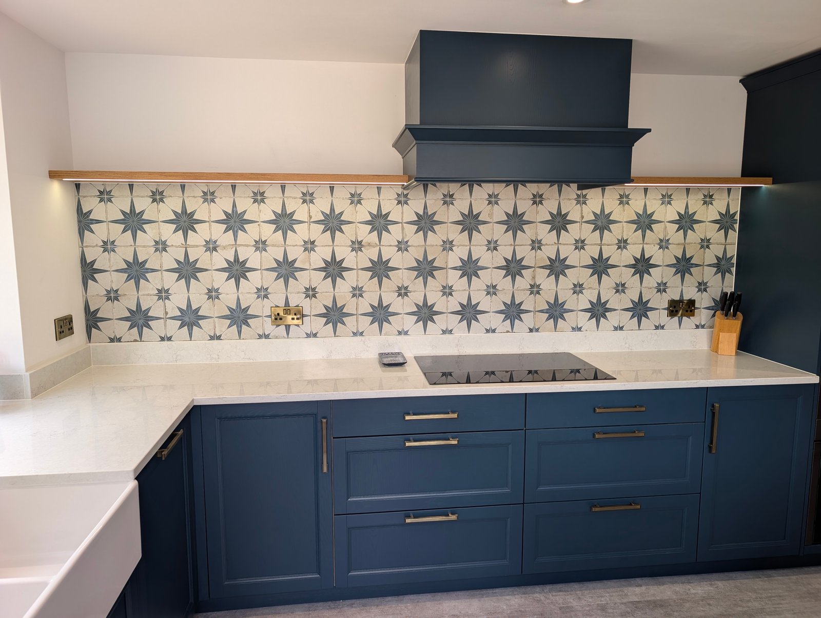
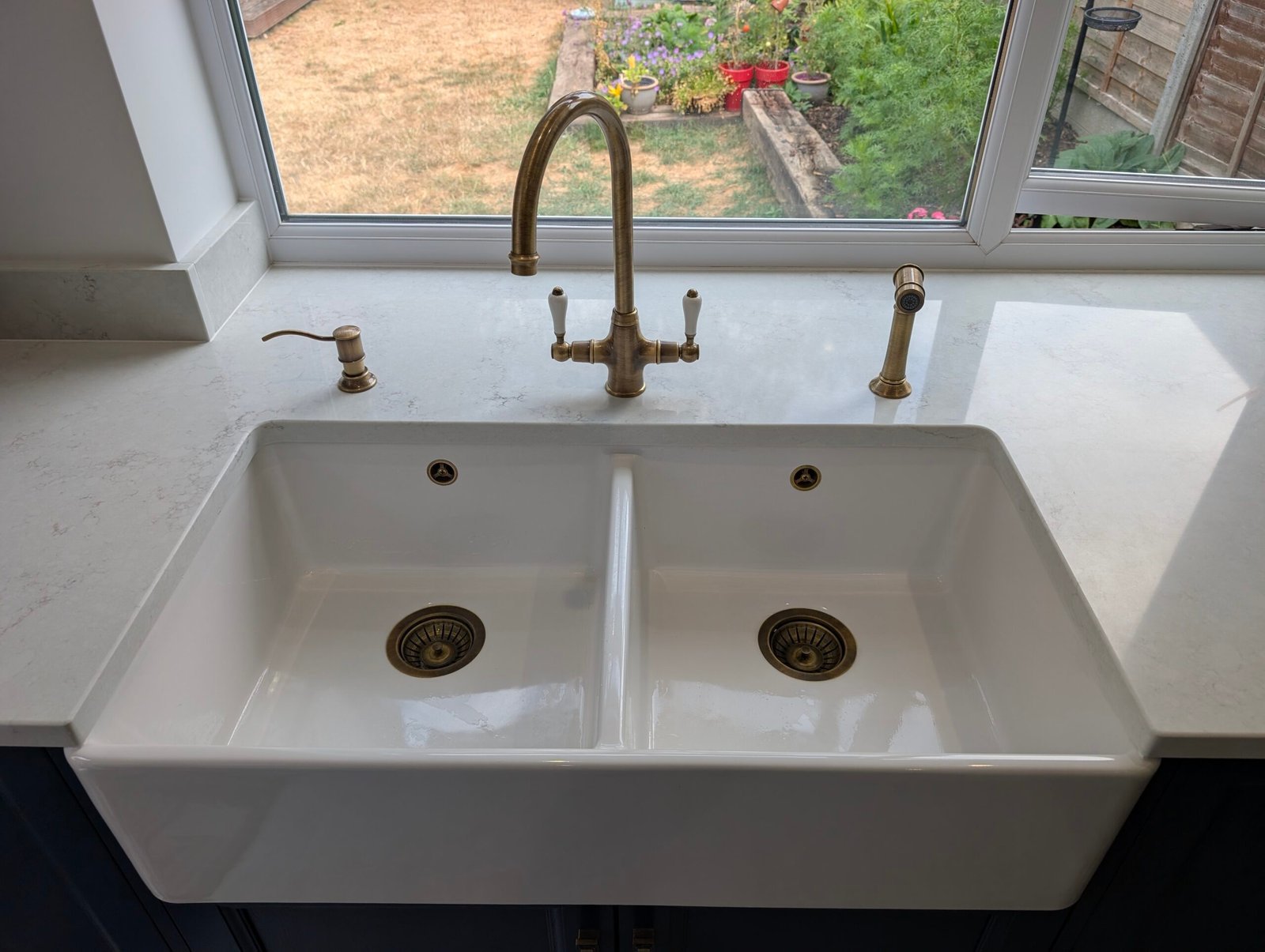
- RS113 Chalk Mist on navy: a soft white that brightens dark blue without glare. Fitted in Wokingham with Nearly Navy units.
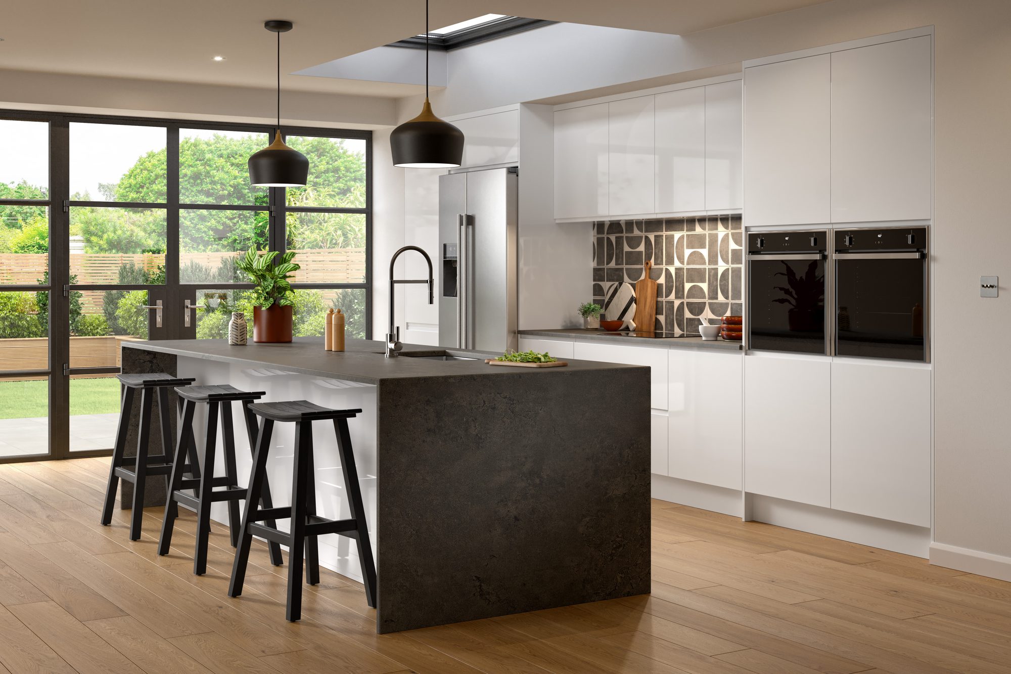
- RS120 Noir Rift on white or pale grey: graphite-black veins on white give clean units a graphic edge.
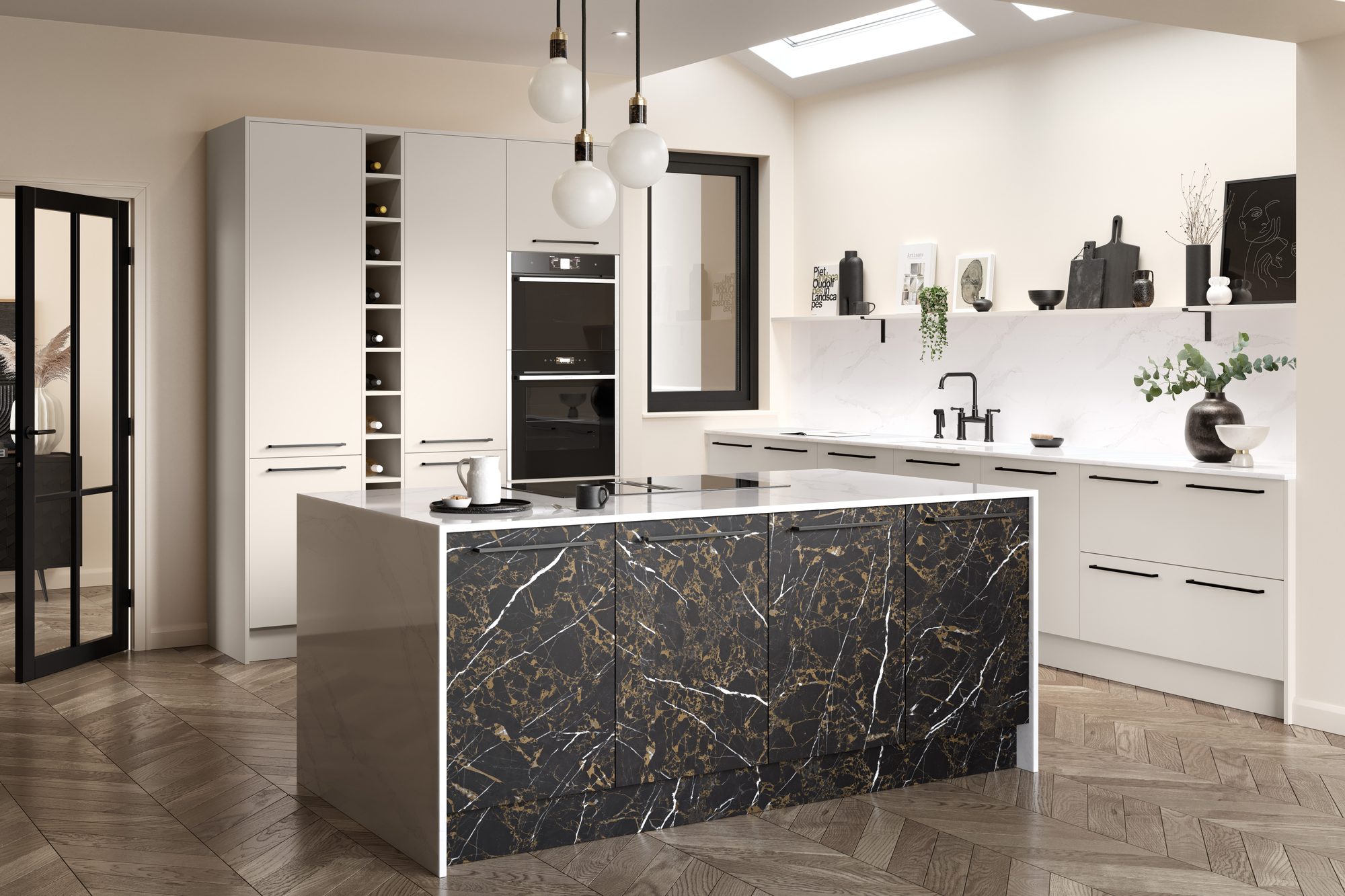
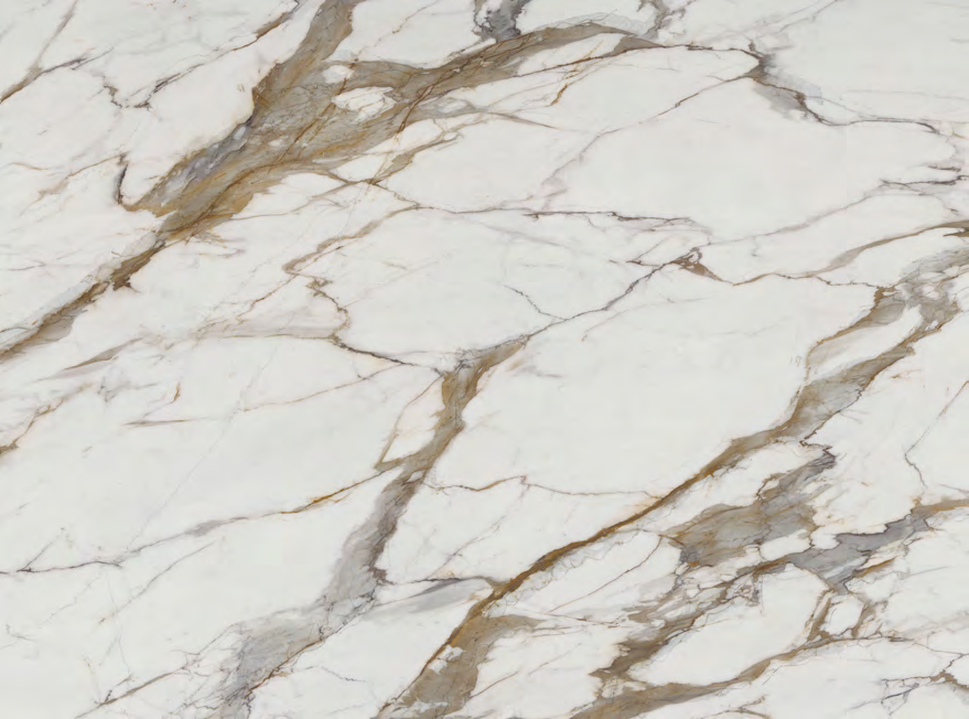
- RS146 Obsidian Gold on white, cream or oak: a charcoal-black worktop with warm gold veins, dramatic against pale doors.
- RS144 Ivory Terrain on black or dark timber: a soft ivory that lifts dark units without looking stark.
Think about: everyday use. A dark worktop on pale units shows crumbs, water marks and fingerprints more than a pale one. Polished finishes are more forgiving than silk.
Blend in
Tonal pairings
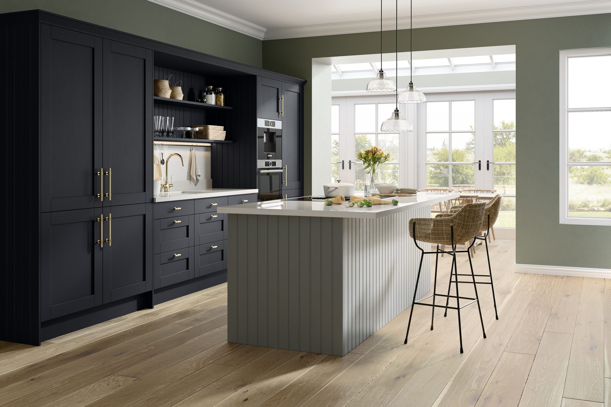
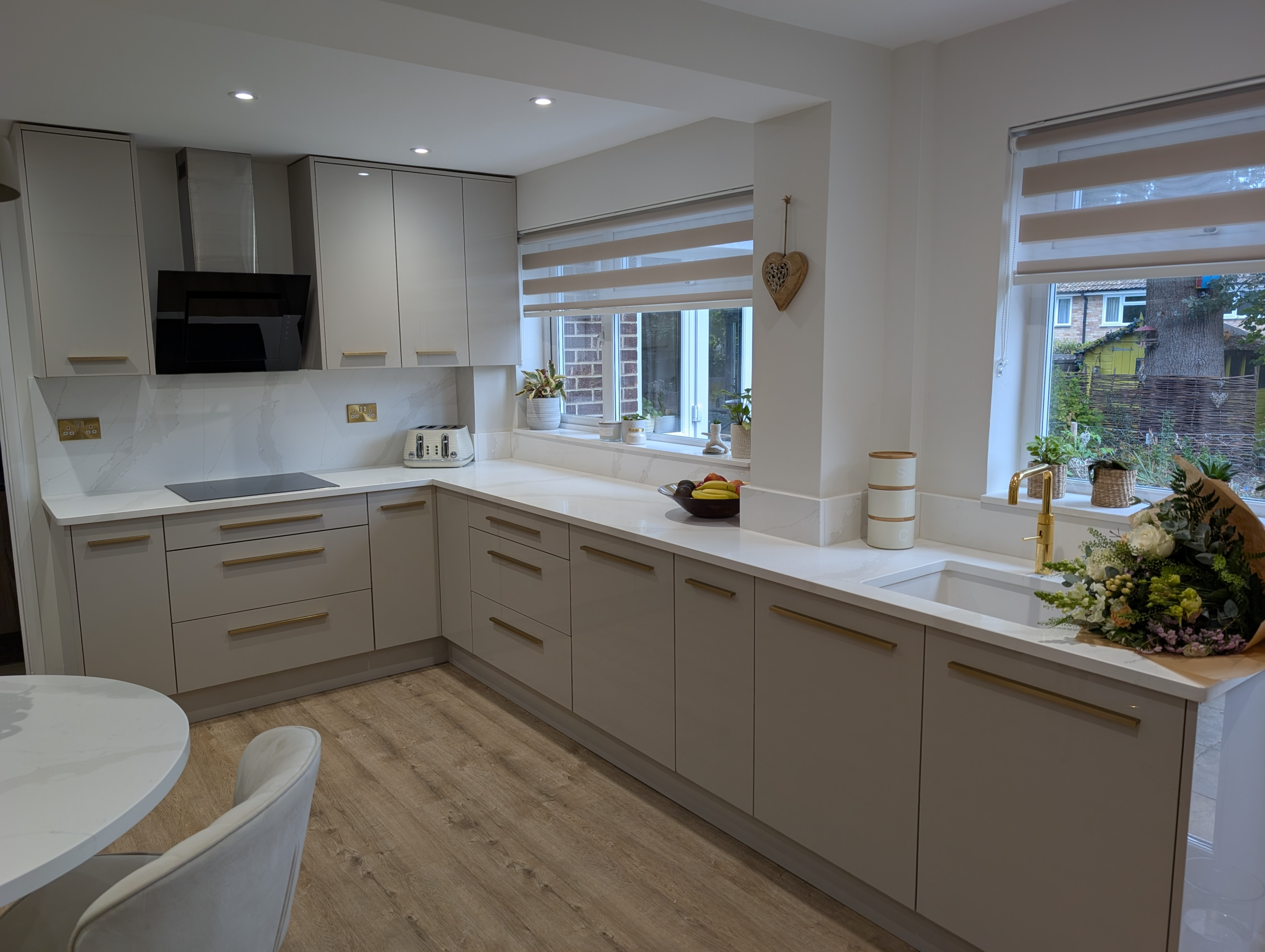
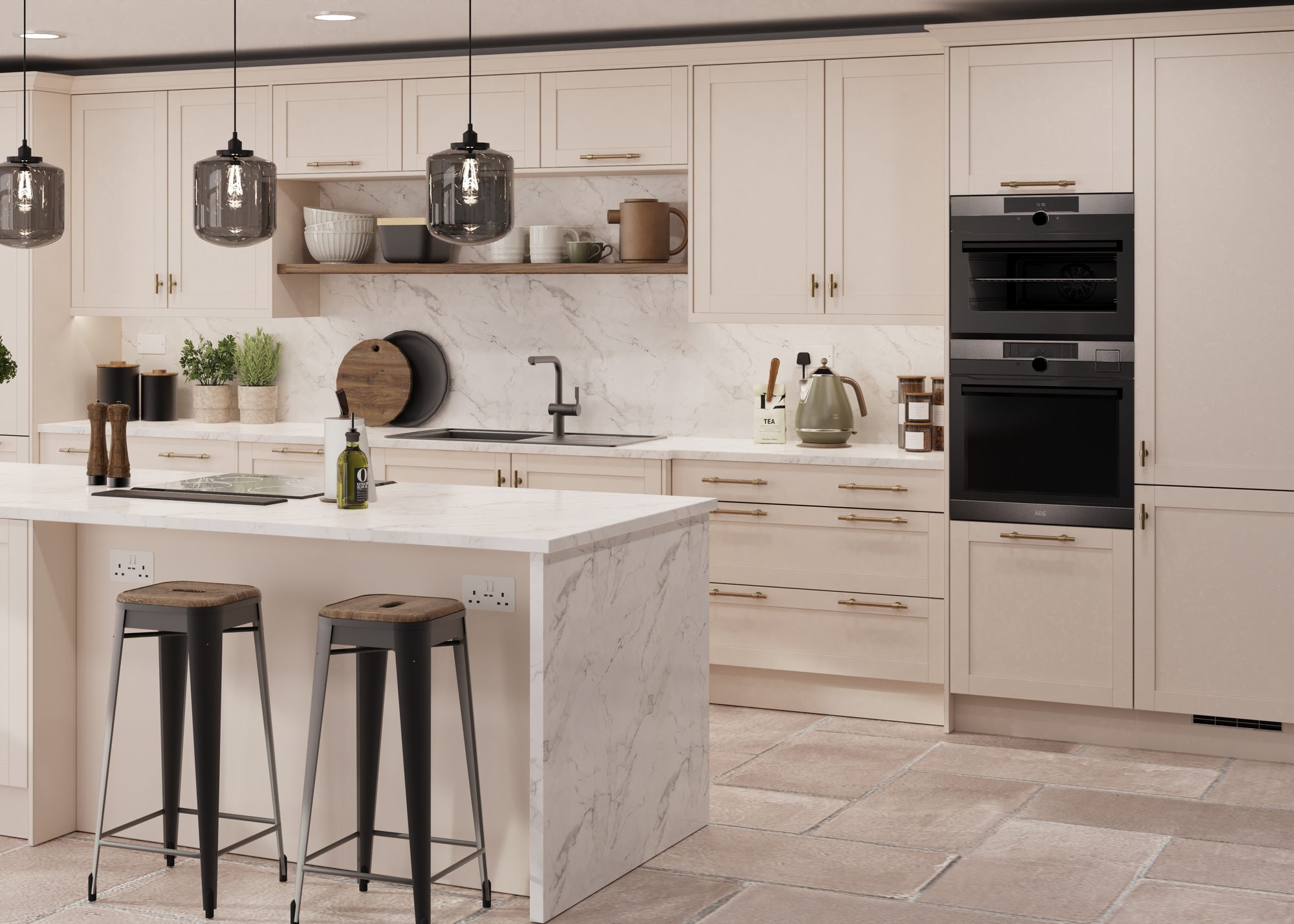
A tonal worktop sits in the same family as the cabinets, so the eye moves smoothly across the room. It suits softer colours and kitchens you want to feel calm.
- RS106 Pearl Haze on cream or light grey: a warm pearl-white with soft, cloudy texture.
- RS139 Champagne Drift on cashmere or greige: a warm greige with very subtle champagne lines, about as tonal as it gets.
- RS104 Frostline on pale gloss: clean white with very fine cool-grey veins. Fitted in Finchampstead with gloss oyster units.
- RS127 Nero Seam on black or charcoal: a deep black with soft-grey veining for a fully dark, tonal kitchen.
Think about: flatness. When everything is the same tone, a kitchen can look washed out. Bring in a little interest with veining, a change of finish, or texture in the splashback or handles.

The bridge
Use the veining to tie it together
The most successful kitchens often sit in between: a worktop that contrasts in colour but repeats something from the room in its veining. That small echo makes the pairing look intended.
- Grey veins with grey units. RS110 Argento Cascade echoes grey cabinets without matching them.
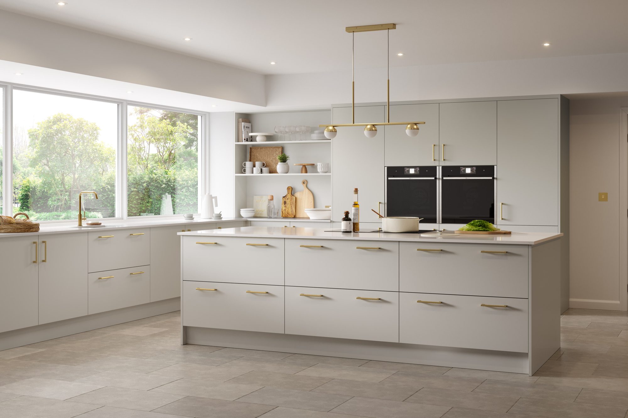
- Gold veins with brass handles. RS105 Gilded Vein picks up brushed brass. Fitted in Yateley with gloss cashmere units.
- Beige veins with warm neutrals. RS145 Ivory Shard carries beige-taupe seams that sit happily with putty and mushroom.
- Green veins with green units. RS130 Verde Strike brings deep green into a white worktop for a bold, matched look.
Think about: taps and handles too. Brass and gold fittings pull towards warm veining; chrome and black towards cool grey.
Two cabinet colours
Two-tone kitchens and islands
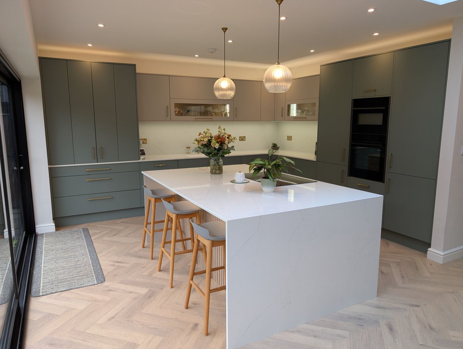
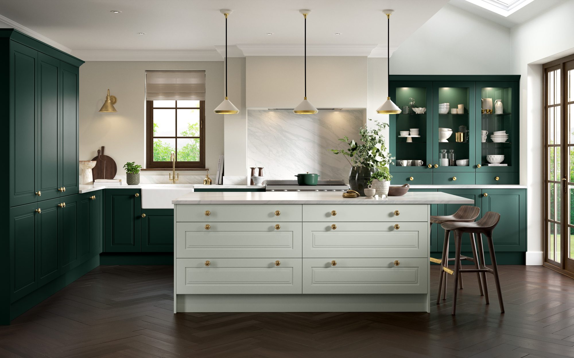
Two-tone kitchens, such as a coloured island with lighter wall runs or darker base units with pale tall units, give you two ways to go.
- One worktop for both. Choose a colour that sits comfortably with each cabinet colour, usually a warm or soft white with gentle veining. RS118 Avorio Trace fitted in Woodley works with both Reed Green and Fawn units.
- A statement island. Keep the wall runs quiet and give the island its own worktop, such as RS140 Molten Gold or RS146 Obsidian Gold.
- Echo the island elsewhere. If the island has its own worktop, repeating it once more (a shelf, a sill or the splashback) stops it looking like an afterthought.
Think about: cost. Two different worktop colours can mean buying more slab than one. We will show any difference clearly in your pricing, so you can decide with the numbers in front of you.
Before you decide
Light, room size and everyday living
How a pairing looks in a photo is only half the story. How it behaves in your room, day to day, matters just as much.
- Light. Dark worktops on dark cabinets need good daylight or lighting. In a north-facing or small room, a paler worktop keeps the kitchen bright.
- Room size. Strong contrast draws the eye to edges and lines, which can make a small kitchen feel busy. Tonal schemes tend to make a room feel larger.
- Splashbacks. A quartz splashback carries the worktop up the wall, which doubles the effect of whichever approach you choose.
- Flooring. The floor is a third colour in the room. Make sure the worktop works with it, not just with the cabinets.
Think about: seeing it in place. Contrast changes with the light through the day, so look at samples against your own doors, in the morning and the evening.
More advice
Ready when you are
Book a free survey and we’ll bring large samples of your favourite colours to your home, measure up and send you written pricing.
Prefer to talk? Call 0118 321 8286 or WhatsApp us.