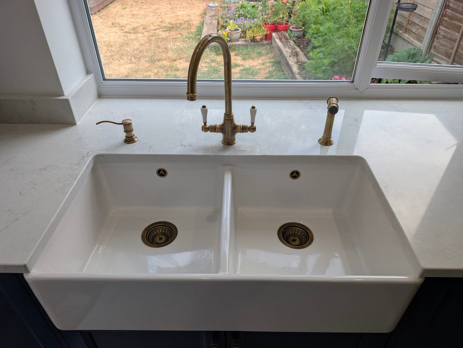
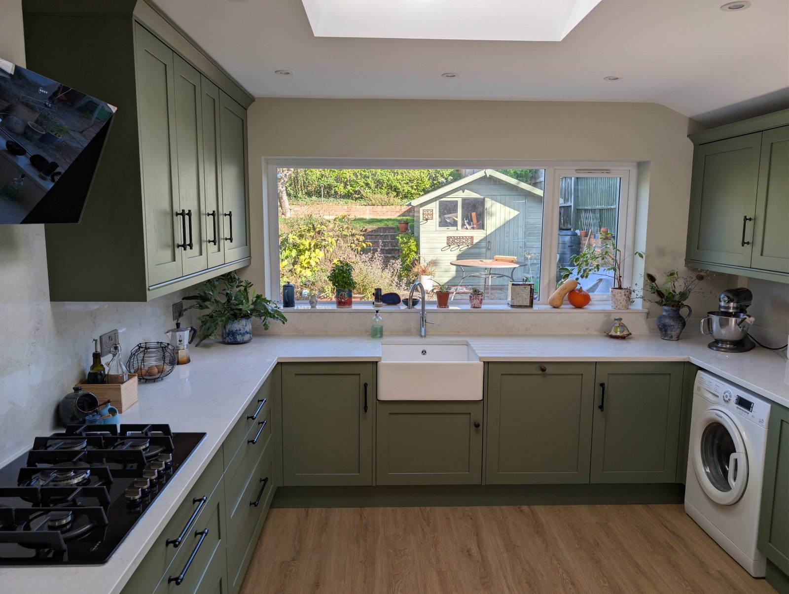
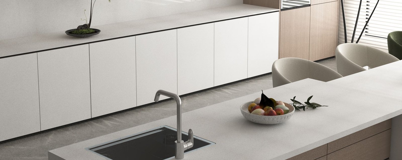
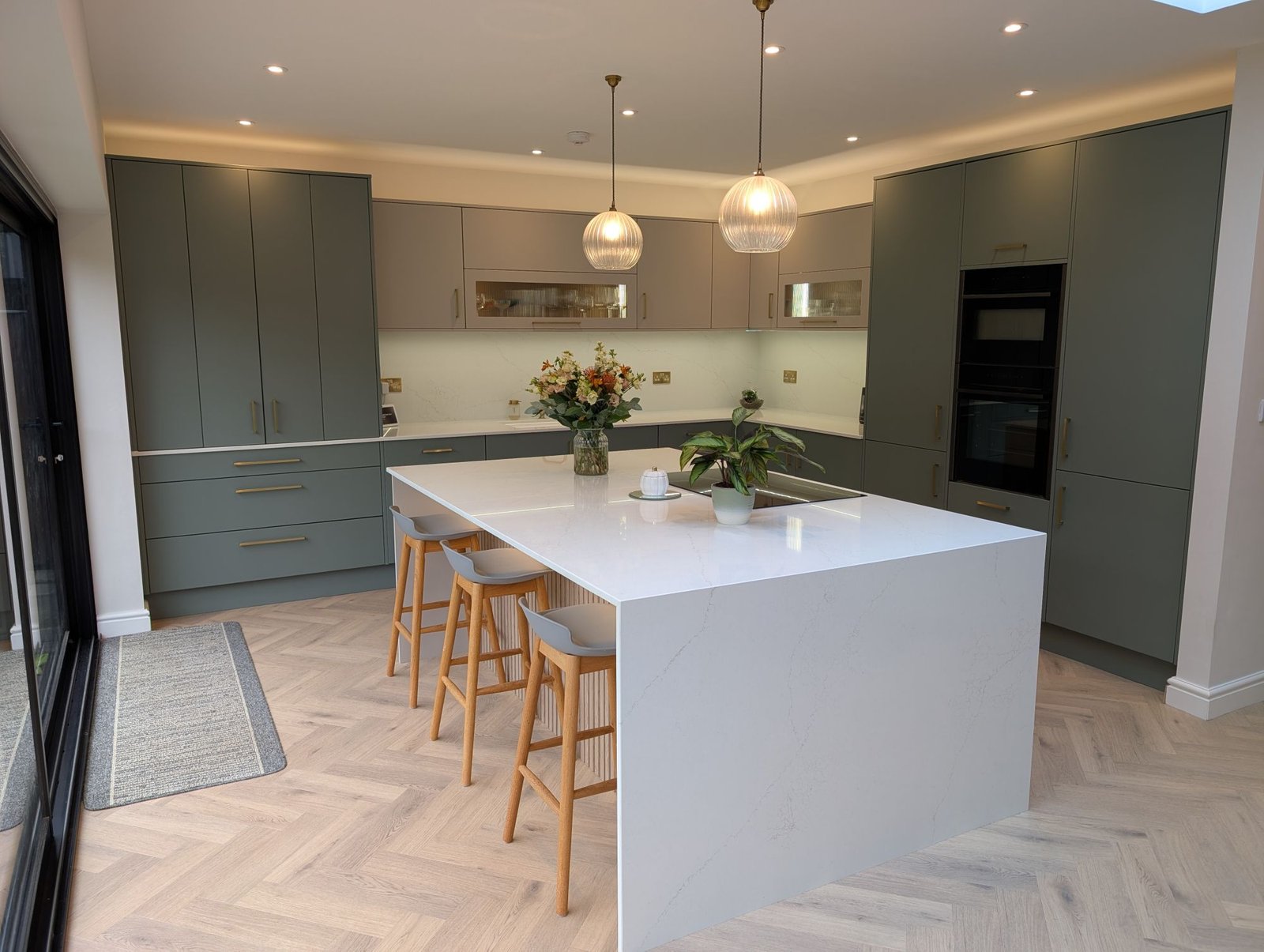
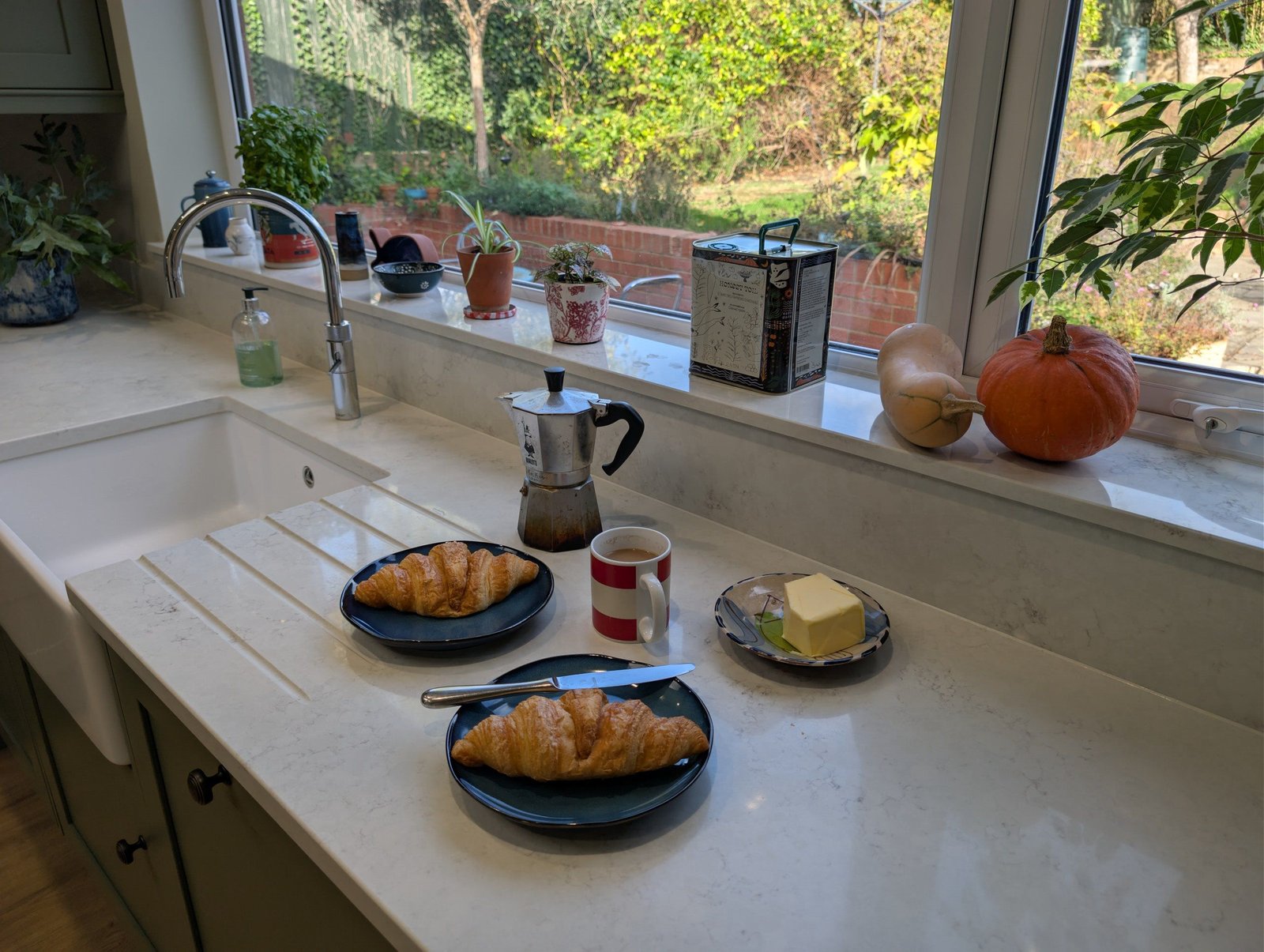
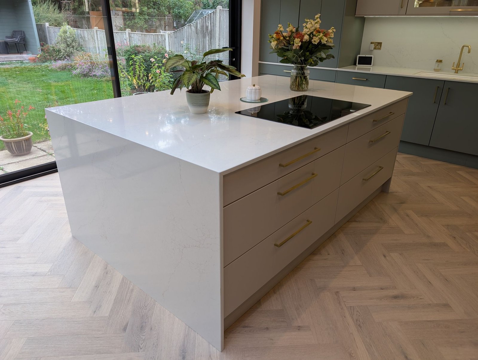
A quiet worktop isn’t a safe compromise. It’s a design decision. Choose a calm surface and you let the rest of the kitchen do the talking: your cabinet colour, your lighting, a beautiful tiled splashback, or simply the view from the window.
It’s one of the most popular choices our customers make, and for good reason. Here’s what makes a quiet worktop work.
Clean, near-solid colour
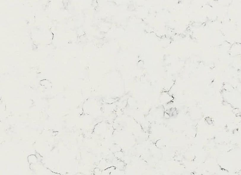
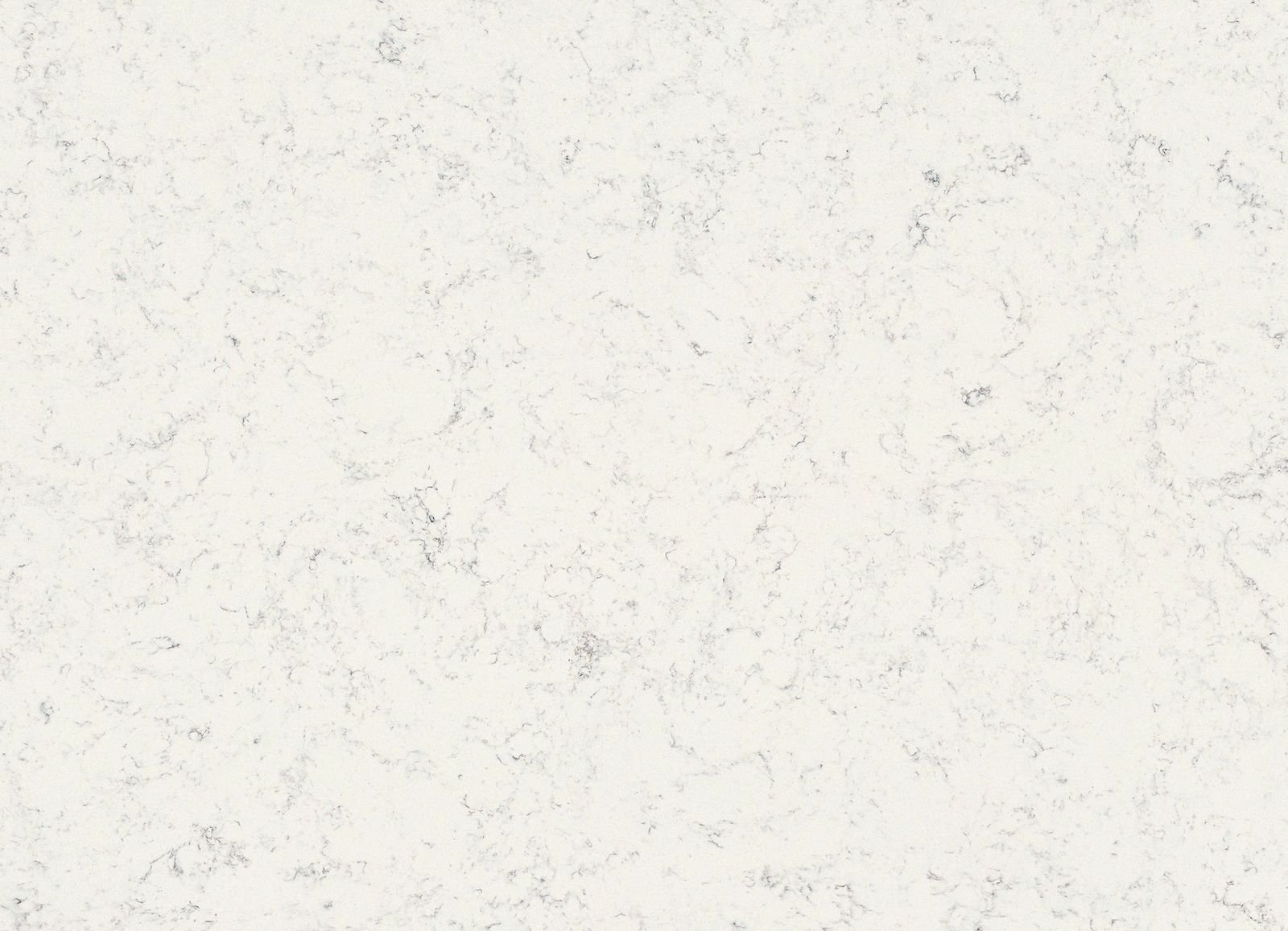
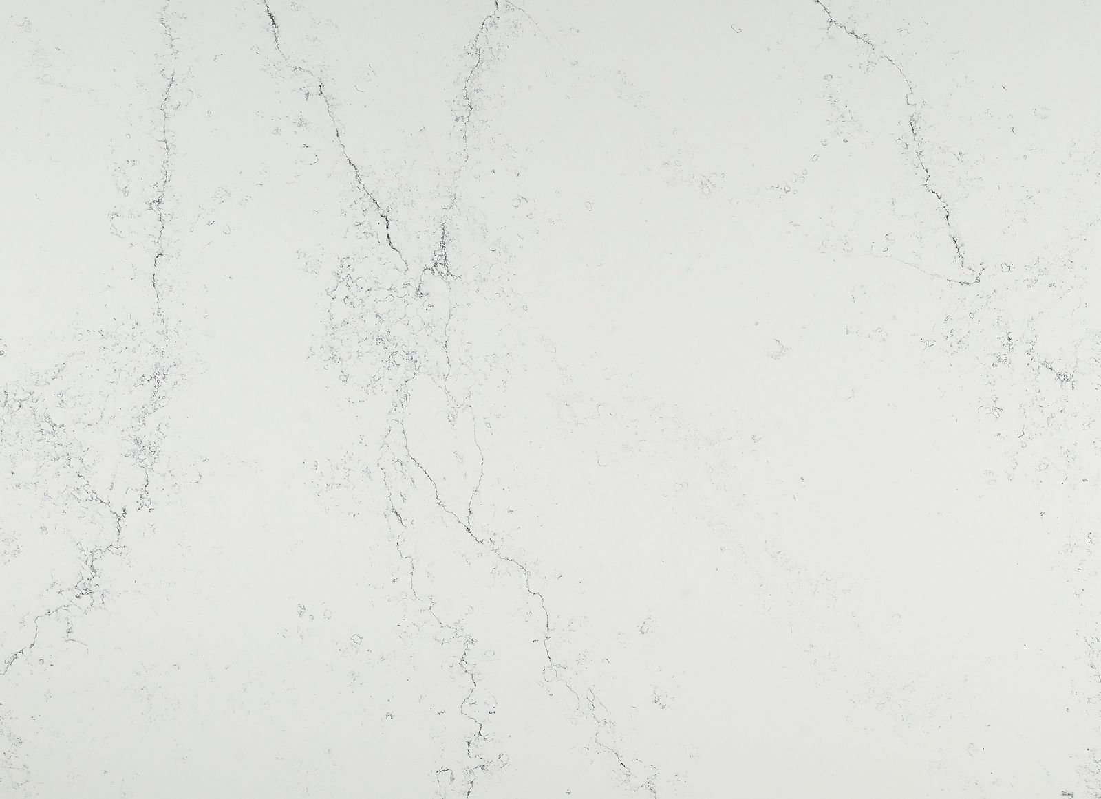
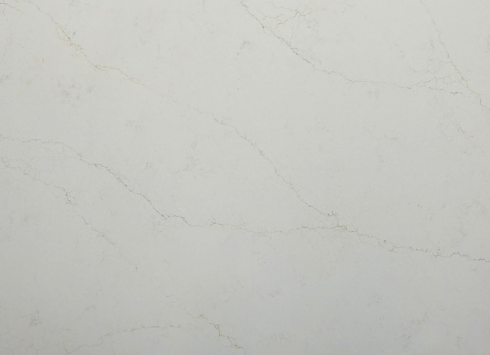
The simplest option: a pale, even surface with little or no pattern. It makes a kitchen feel lighter and larger, and pairs with almost any cabinet colour. Try Chalk Mist or Dove Mist.
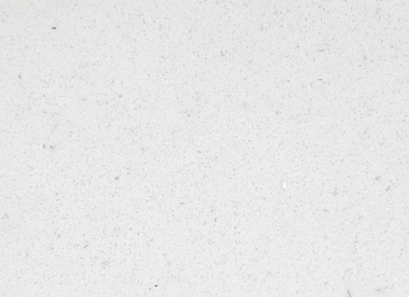
Fine grain and speckle
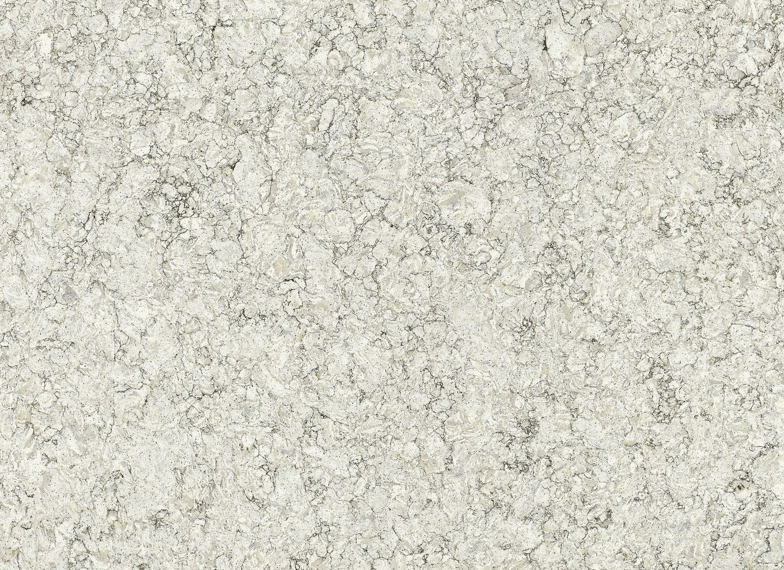
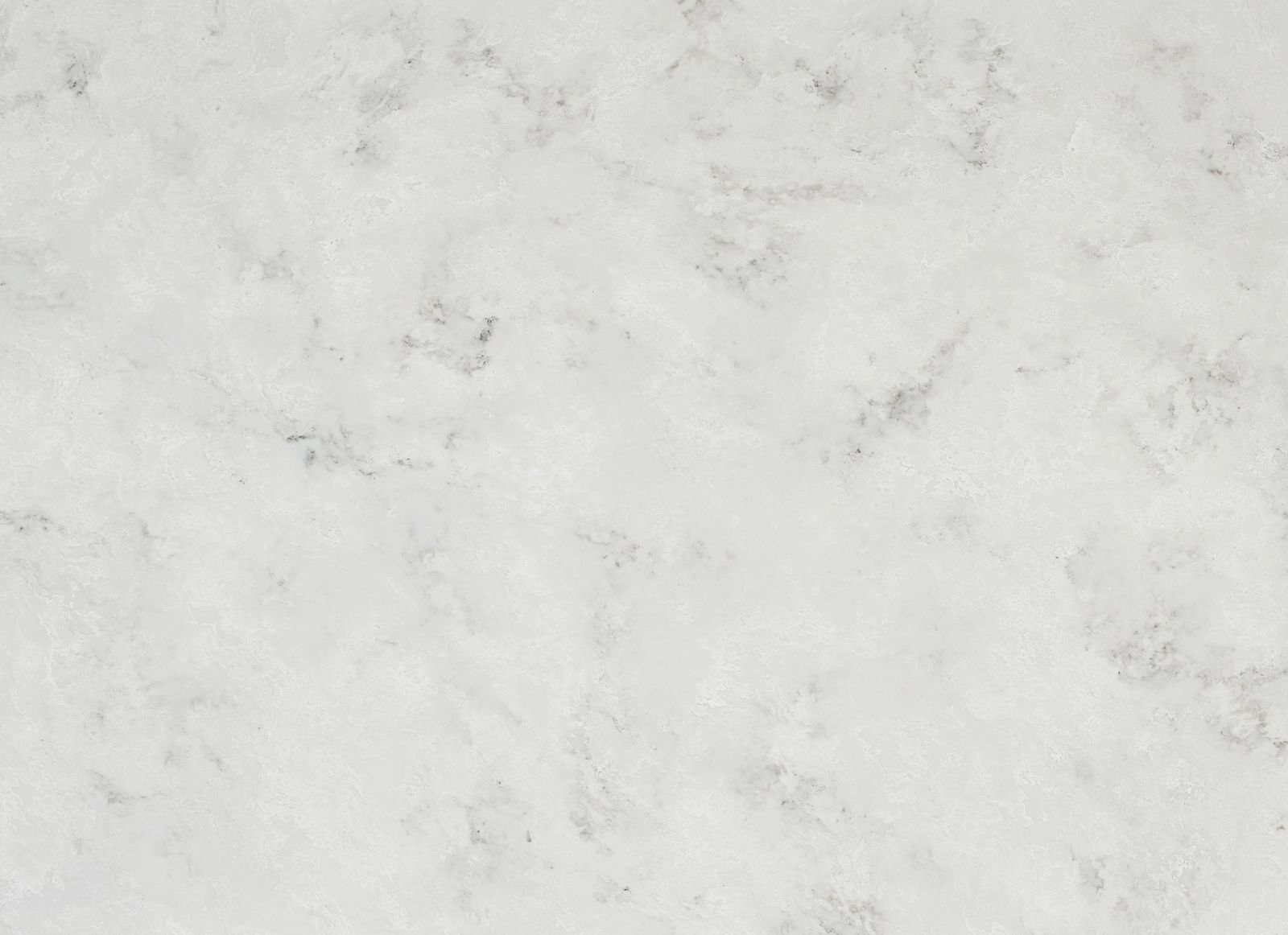
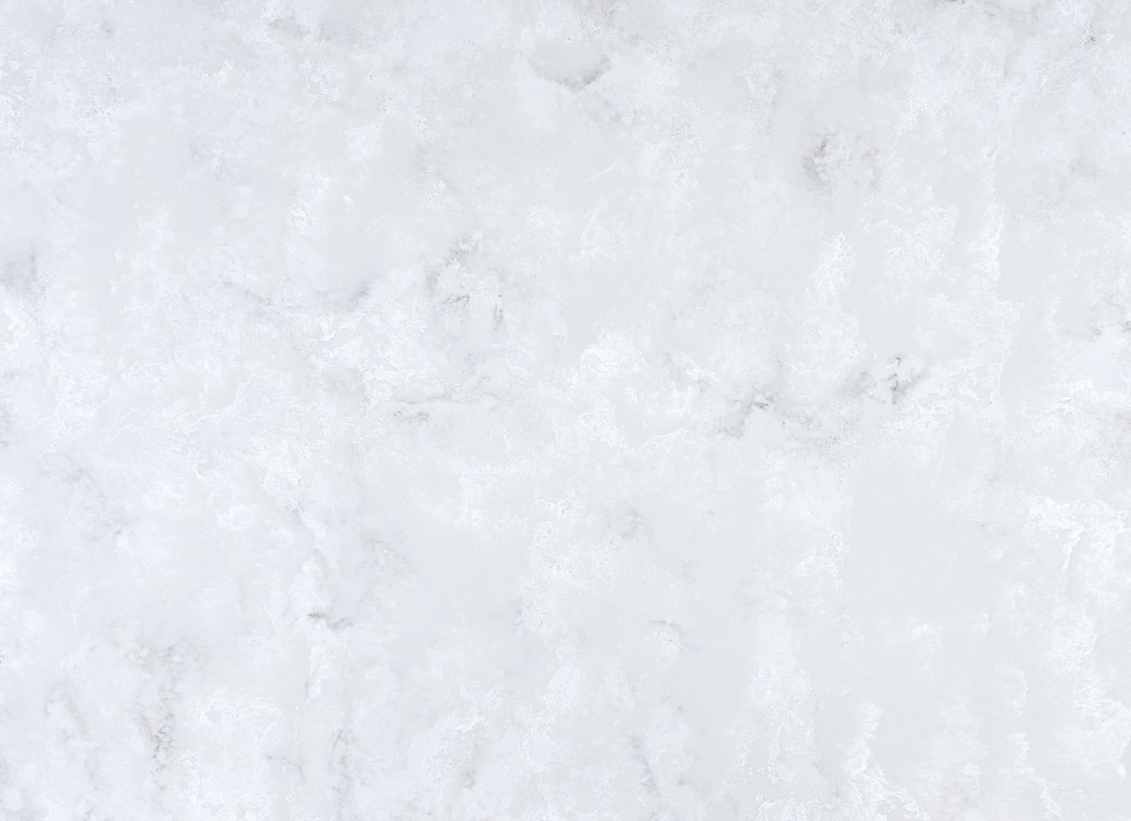
A gentle, all-over texture, sometimes with a touch of sparkle. It stops a pale worktop looking flat without adding any direction or drama. Try Crystal Dust, Pearl Grain or Glacier Cloud.
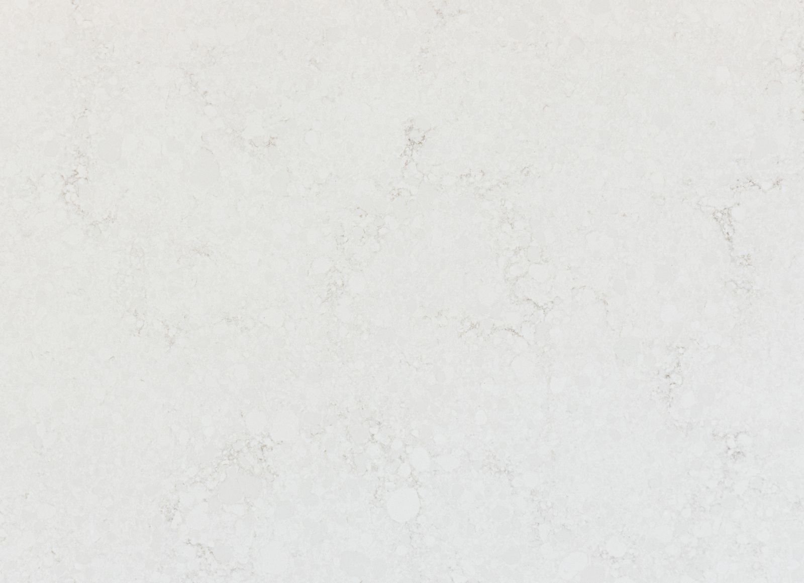
Quiet doesn’t mean plain. A warm, creamy ground brings out timber and brass; a cool white sharpens greys and chrome. A polished finish bounces light around the room, while a silk finish feels soft and velvety to the touch. Every colour page has a short “Designer’s view” to help you see what each one does.
With bold or painted cabinets. A deep green, navy or terracotta kitchen needs a calm partner, not a competitor.
In smaller or narrower kitchens. A pale, even surface reflects light and keeps the space feeling open.
Next to a busy splashback. Patterned tiles or a feature wall look their best against a quiet worktop.
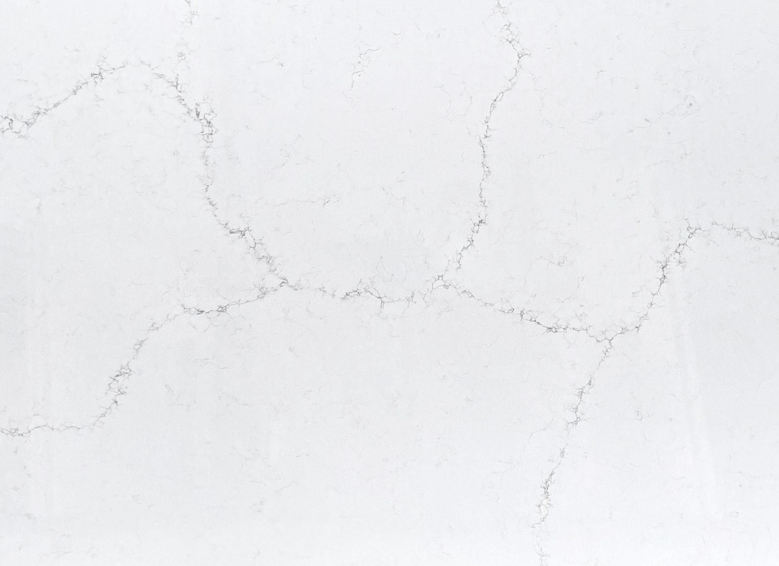
On long runs and L-shapes. Where a worktop needs joints, a calm pattern makes them far less noticeable, because there are no bold veins to line up.
If you might sell in a few years. Quiet colours appeal to the widest range of buyers.
What do you want people to notice first? If it’s the worktop, go bold. If it’s the cabinets, the colour or the view, go quiet.
How much pattern is already in the room? Busy tiles or flooring usually call for a calmer surface.
Is there a natural feature surface? An island or a single uninterrupted run is the perfect place for a statement slab. Long runs with joints suit quiet patterns better.
Could you have both? A quiet colour on the main runs with a statement island is a lovely way to have the best of each.
The colours
Quiet colours
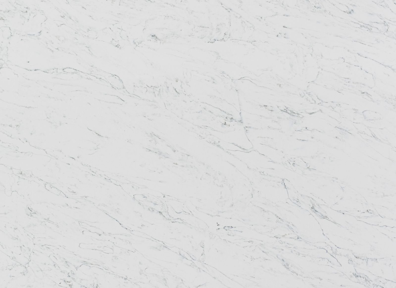
Calm whites and soft creams, from crisp and cool to warm and gentle. Or browse all the colours.