Colour pairing
Find the worktop that suits your cabinets
Start with the colour you live with. For each cabinet colour, here are the quartz colours we’d shortlist, why they work, and one thing to think about before you choose.
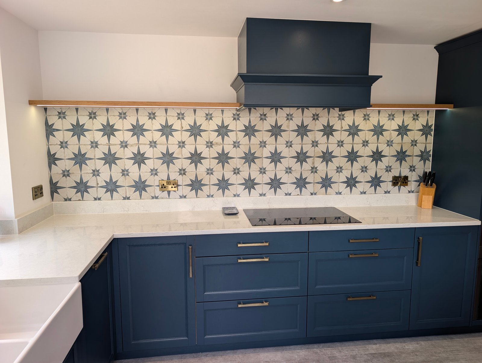
Green kitchens
Sage, olive and deep green
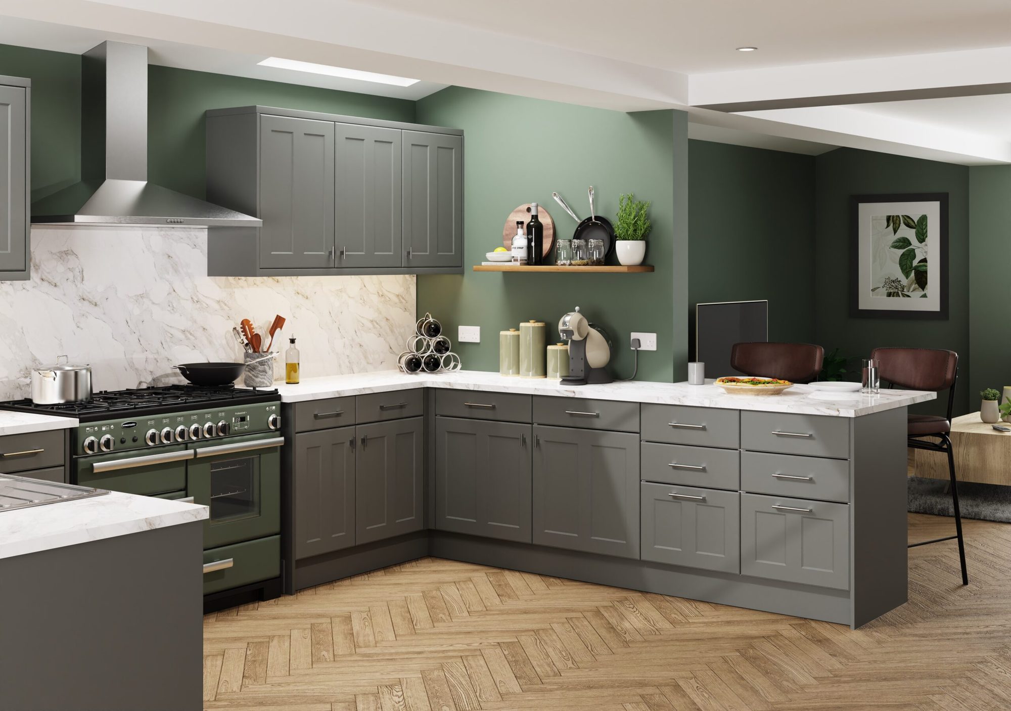
Green is the colour of the moment, from soft sage to deep olive. It already brings plenty of character, so the worktop’s job is usually to calm and lift it. Warm whites keep green soft; cooler whites make it crisper.
- Taupe Ridge: bold taupe-champagne veins on bright white that stand up to deeper greens. Fitted in Wokingham with Sap Green units and a full-height splashback.
- Chalk Mist: a chalk-white with barely-there warm-grey texture that lets the cabinet colour lead. Fitted in Twyford with sage shaker units.
- Avorio Grain: a warm pale ground with a fine, even speckle that hides crumbs, so it suits a busy family kitchen. Fitted in Reading with Meadow Green units.
- Avorio Trace: warm white with very fine gold-toned veins that pick up brass handles and lighting. Fitted in Woodley with a Reed Green island.
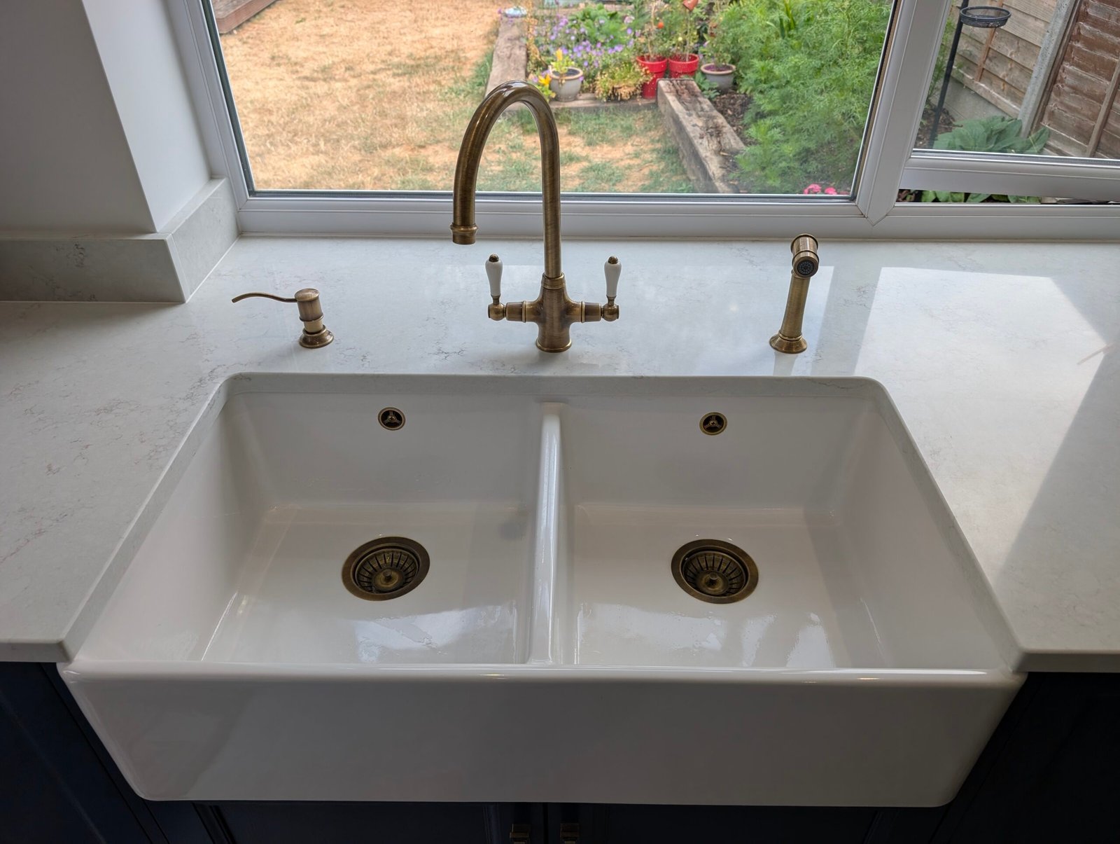
Think about: handles and taps. Brass or gold fittings? Lean towards a warm white or gold veining. Black or chrome? A cooler, cleaner white sits better.
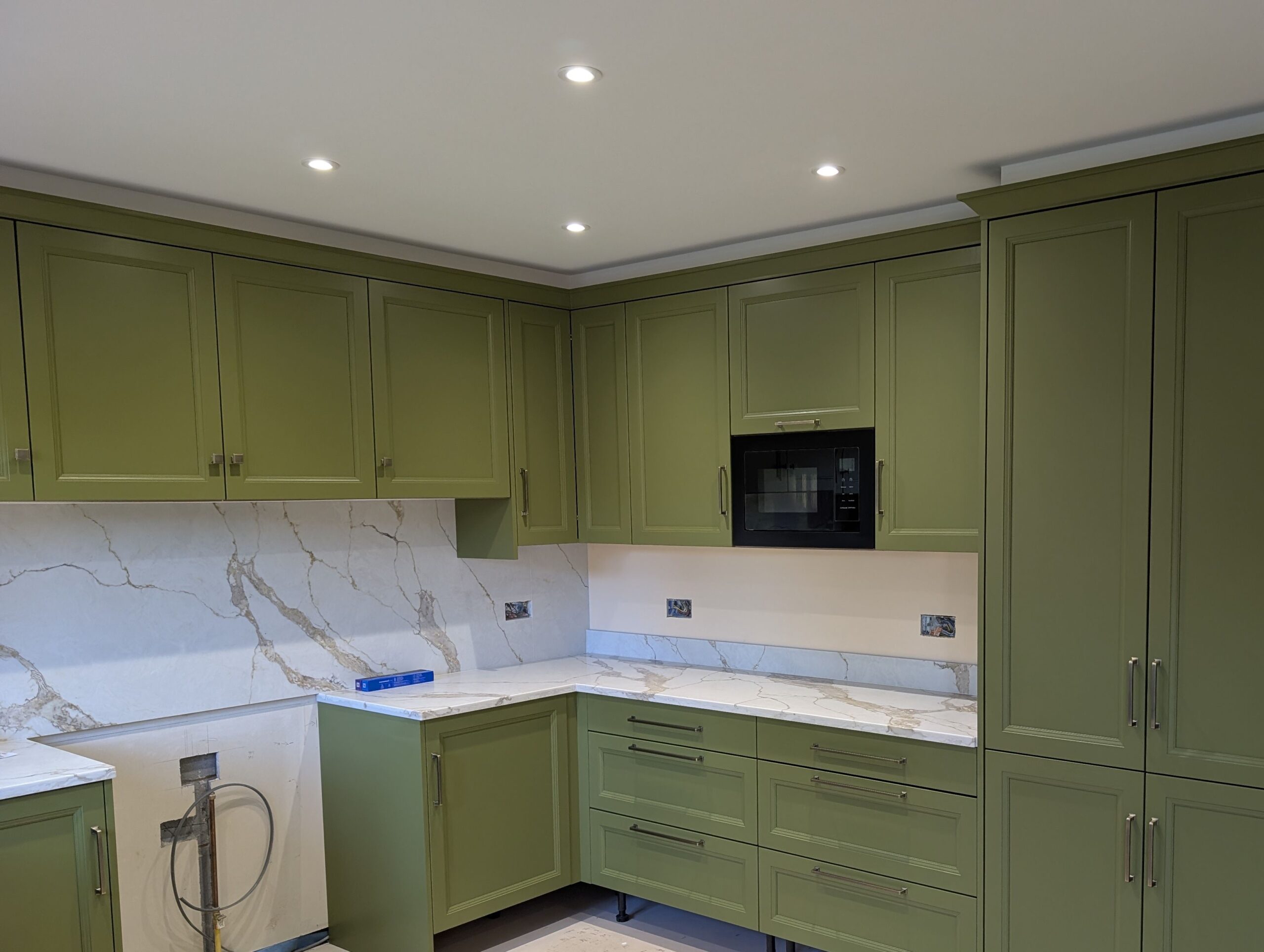
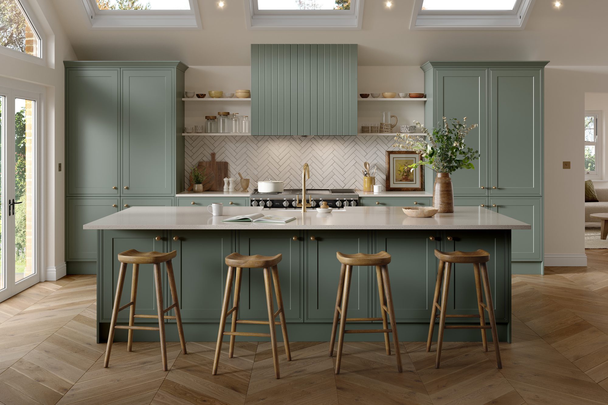
Blue kitchens
Navy and inky blue
Navy is classic and calm, and it’s a natural partner for brass. A pale worktop gives the contrast that stops a dark blue kitchen feeling heavy, and reflects light back into the room.
- Chalk Mist: a soft white that brightens navy without glare. Fitted in Wokingham with Nearly Navy beaded shaker units and a blue star tile splashback.
- Bianco Seam: clear white with long, fine cool-grey veins. Crisp with chrome taps and handles.
- Gilded Vein: bright white with fine grey veins and restrained gold highlights that tie in brass fittings.
- Golden Lode: warm-gold branching veins for a confident statement on a navy island.
Think about: light. North-facing kitchens make blue look darker and cooler. A warm white worktop stops the room feeling cold.

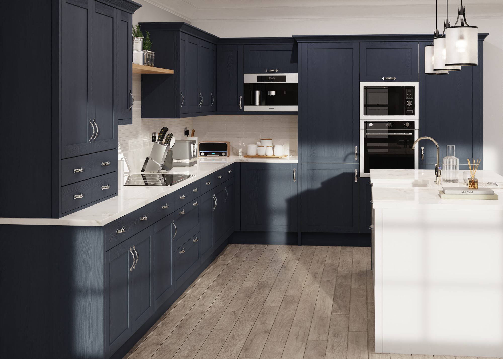
Grey kitchens
Grey and charcoal
Grey can tip into cold. The worktop sets the temperature: a warm white softens grey, while a cool white with grey veining keeps it sleek and modern.
- Pearl Haze: a warm pearl-white with soft, cloudy texture that takes the chill off light and mid greys.
- Argento Cascade: broad, flowing silver-grey veins that echo grey cabinets without matching them.
- Noir Rift: graphite-black veins on white that link a charcoal kitchen to a bright worktop.
- Graphite Cloud: a mid-grey, concrete-like surface for a tonal, industrial look with pale grey or white units.
Think about: undertone. Greys lean blue, green or brown. Hold a sample against a door and choose a worktop that leans the same way.
White and cream kitchens
White and cream
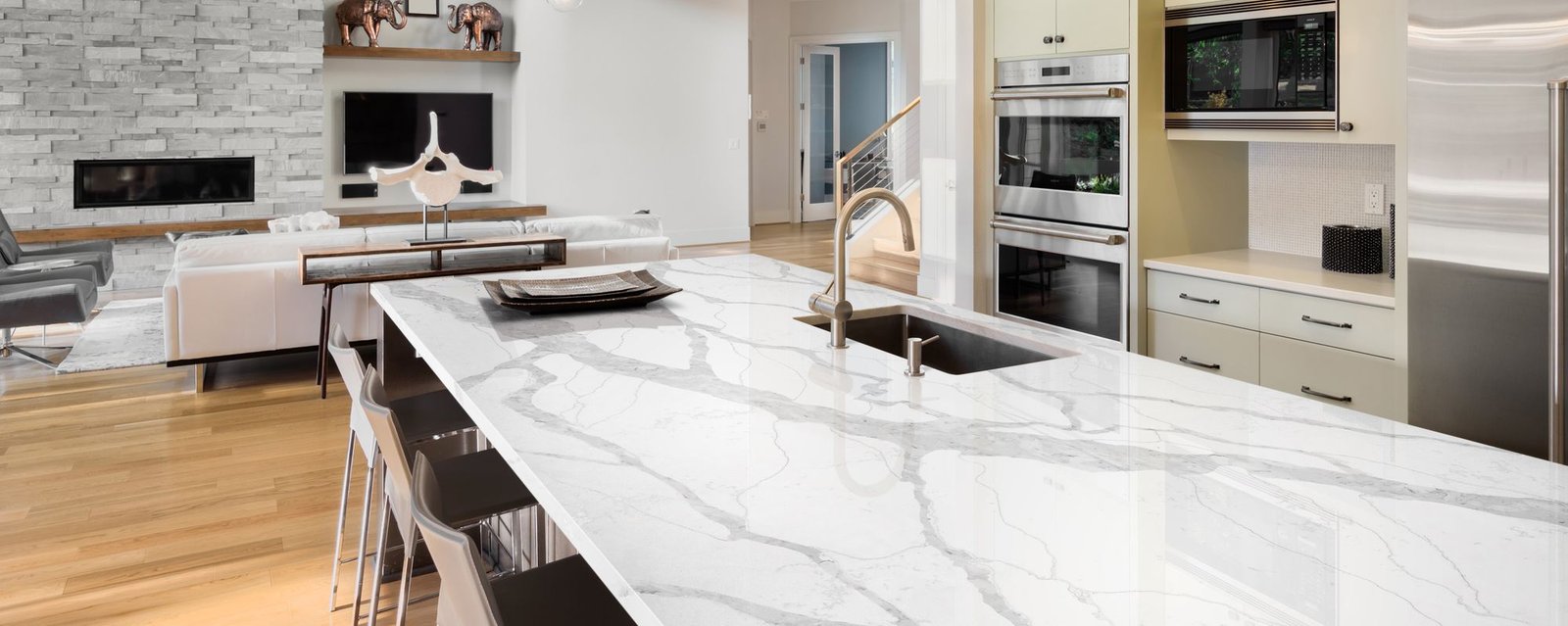
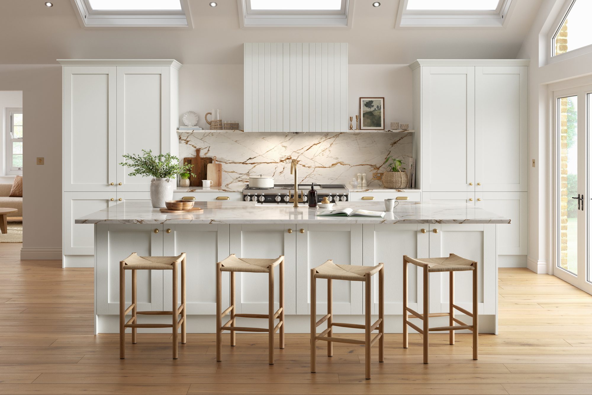
With white or cream units, the worktop either becomes the feature or completes a calm, all-light scheme. Both work. What matters is getting the whites to agree.
- Frostline: clean white with very fine cool-grey veins, a crisp partner for white and pale gloss. Fitted in Finchampstead with gloss oyster handleless units.
- Silver Rift: elegant branching silver-grey veins that add definition, so an all-white kitchen doesn’t look flat.
- Ivory Shard: ivory-white with beige-taupe seams: a tonal partner for cream doors.
- Molten Gold: bold metallic-gold veins on bright white, if you want the worktop to be the star.
Think about: matching whites. A bright white worktop can make cream doors look grubby. Put samples side by side, and with cream, go warm.

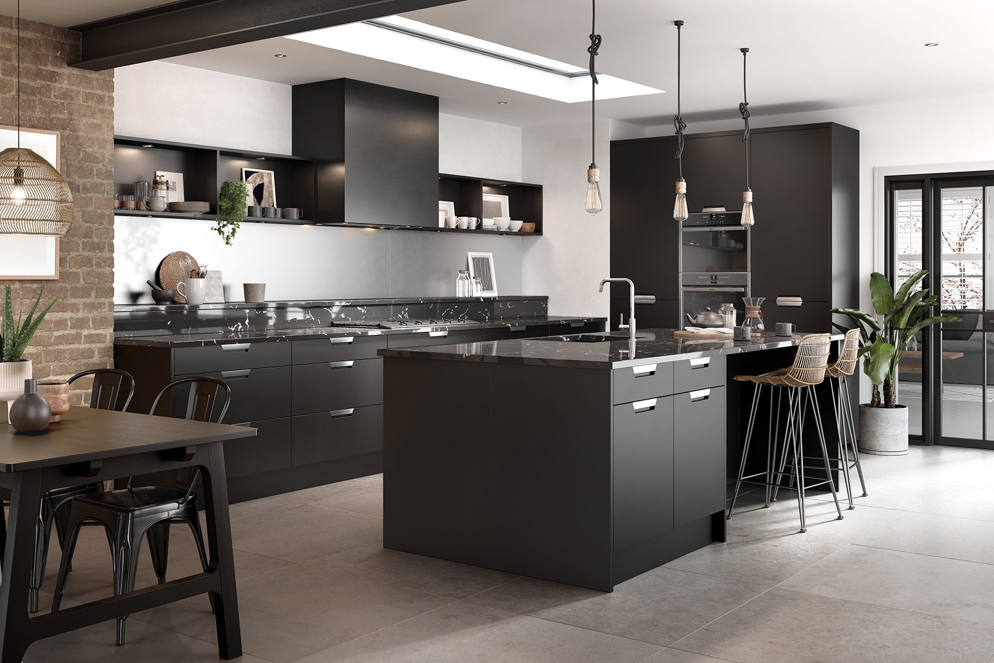
Black and dark kitchens
Black and dark
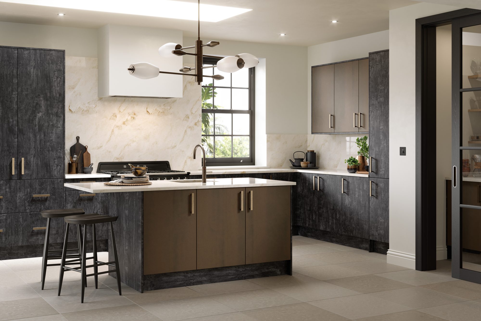
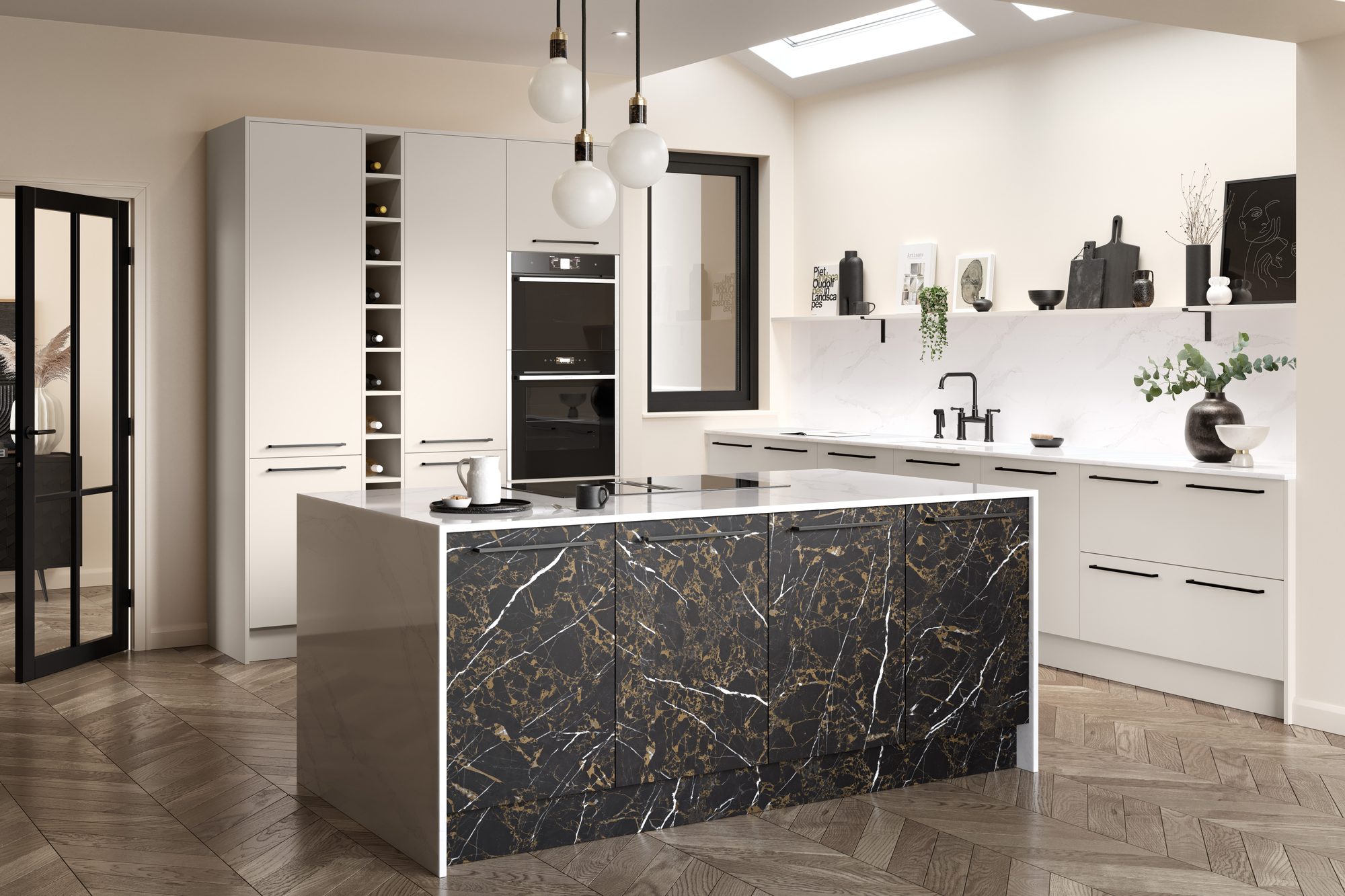
Dark cabinets give a dramatic, grown-up look. A bright worktop with bold veining brings light back into the room and makes the scheme feel deliberate.
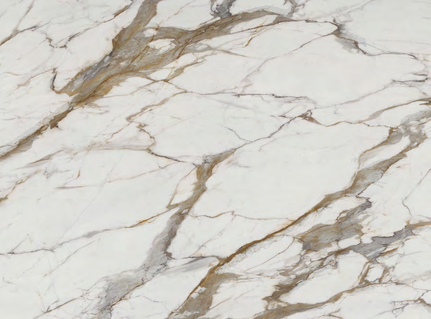
- Oro Shard: large white forms divided by grey and warm-gold seams: dramatic against black.
- Copper Canyon: copper-rust veins on clean white, a warm accent for black or dark timber.
- Gilded Cascade: broad grey sweeps edged with warm gold for a softer statement.
- Nero Seam: a deep black with soft-grey veining in a silk finish, for a fully dark, tonal kitchen.
Think about: everyday use. Dark worktops, and silk finishes in particular, show fingerprints, water marks and crumbs more than pale polished ones. If you love the all-dark look, choose it knowingly.
Wood and oak kitchens
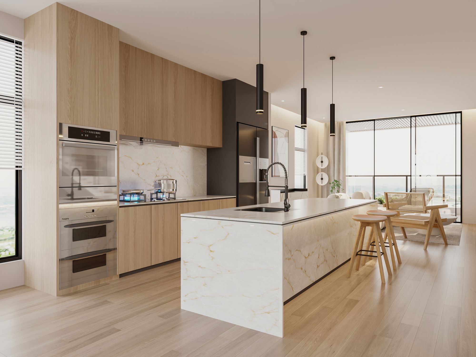
Wood and oak
Timber brings warmth, so the worktop should share it. Creams and warm whites sit happily with oak; stark, cool whites can make timber look orange.
- Amber Vein: a creamy ground with soft amber-gold veins that picks up the tones in oak.
- Crema Flow: soft ivory with a warm beige-gold flow, gentle enough for a lot of timber.
- Champagne Vein: warm white with fine champagne-beige veins: light, but never stark.
- Ivory Terrain: a softly crystalline ivory with broad natural variation, for a relaxed, natural feel.
Think about: the floor. If you have wooden floors as well, choose a worktop that bridges cabinets and floor rather than adding a third tone.
Warm neutral kitchens
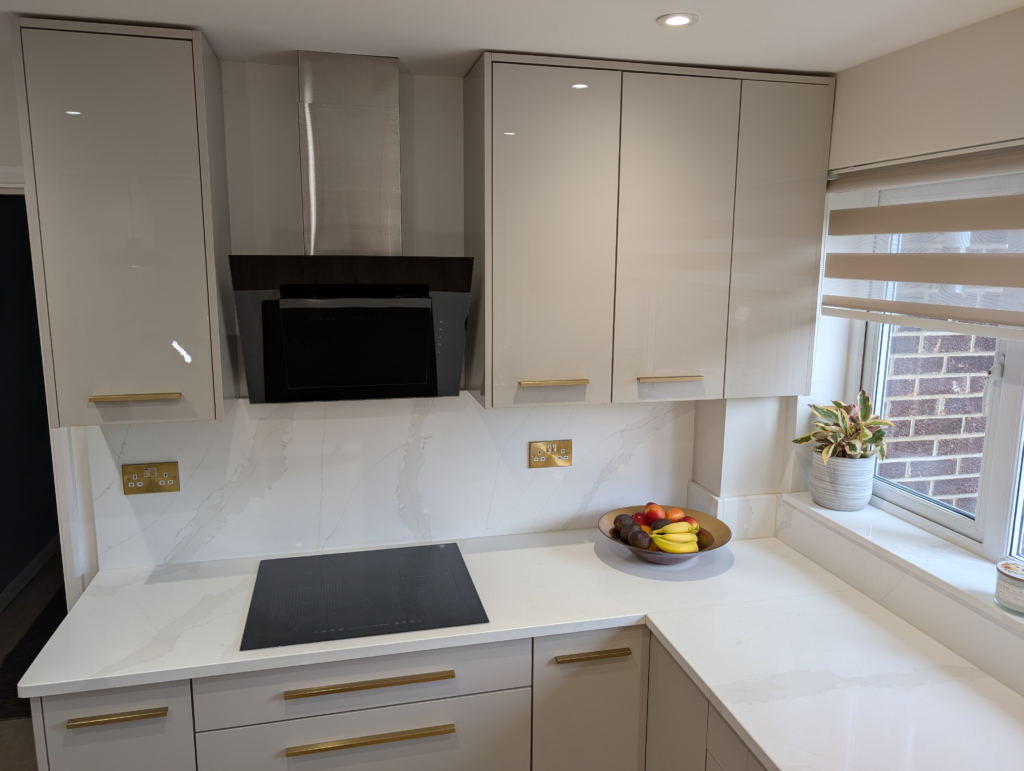
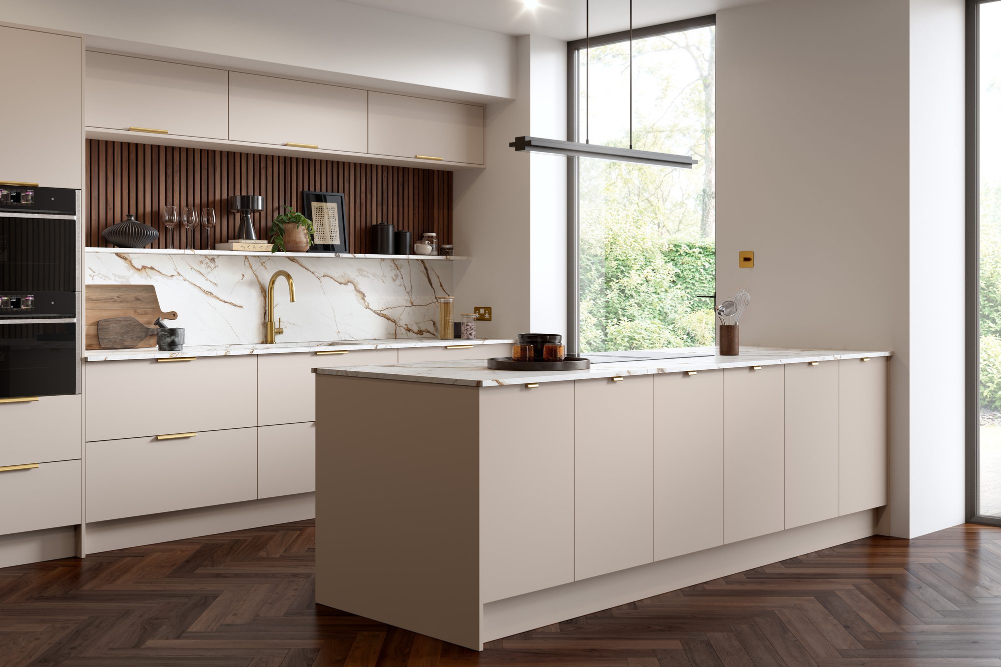
Putty, mushroom, cashmere and greige
Soft, warm neutrals are some of the most popular kitchen colours right now. They suit worktops from the same warm family, so the whole room feels calm and joined up.
- Gilded Vein: bright white with grey veins and restrained gold. Fitted in Yateley with gloss cashmere units and brushed brass handles.
- Champagne Drift: a warm greige with very subtle champagne lines in a silk finish: about as tonal as it gets.
- Taupe Strata: warm grey and sandy layers with soft horizontal movement.
- Ivory Flow: warm white with flowing ivory and beige veining, lifted by delicate gold-grey detail.
Think about: contrast. A fully tonal scheme can feel flat. Add interest with veining, a change of finish, or a contrasting island.
More advice
Ready when you are
Book a free survey and we’ll bring large samples of your favourite colours to your home, measure up and send you written pricing.
Prefer to talk? Call 0118 321 8286 or WhatsApp us.